Productivity / Organisation App Brand design - Becky
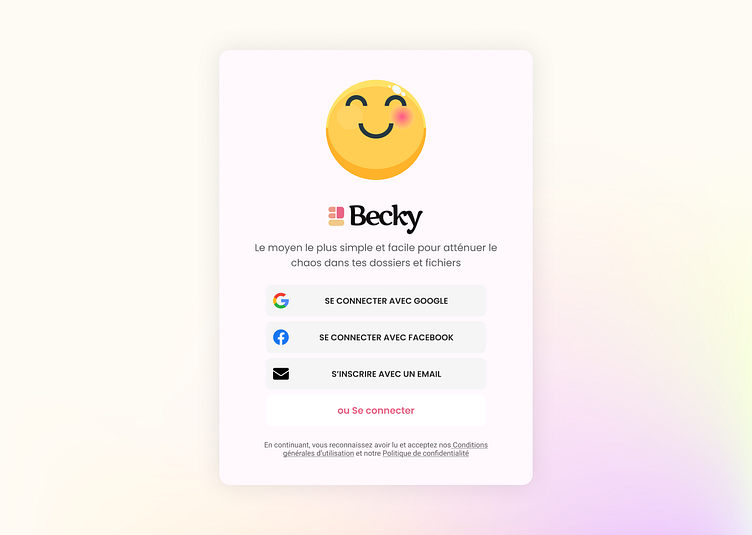
Becky is a desktop application used to assist and automate the process of file organization. It is designed to be extremely simple to use, powerful and very intuitive with great flexibility.
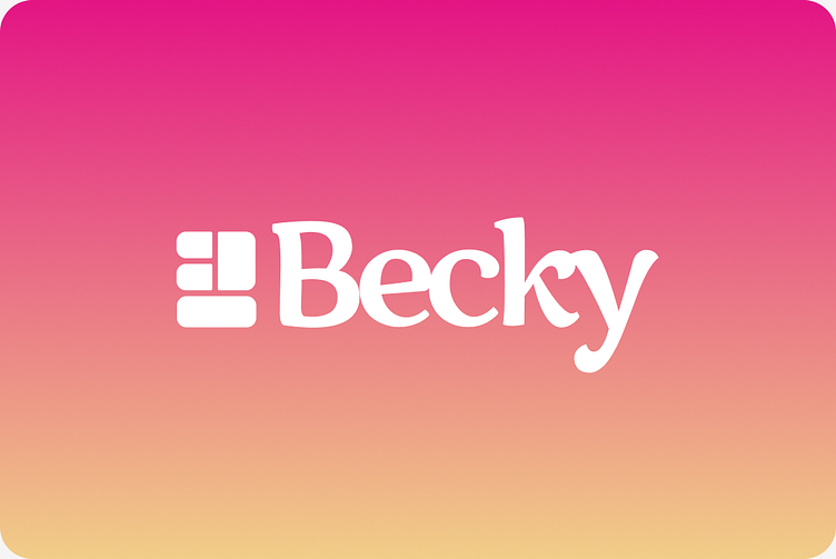
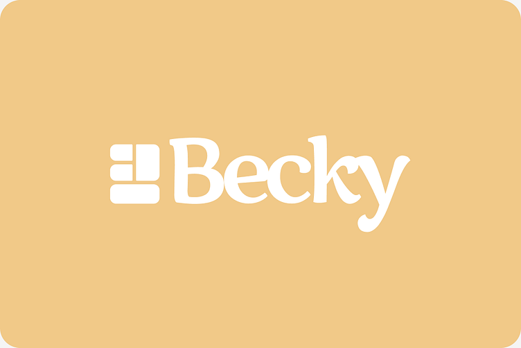
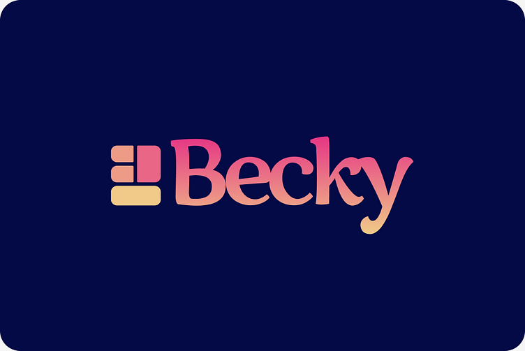
Becky’s logo is a composition of basic shapes of different colors arranged to make the letter “B” for Becky. Instead of going for a more complex or extravagant representation, we chose this to implicitly outline the simplicity of Becky, one of its key features.


Design Psychology
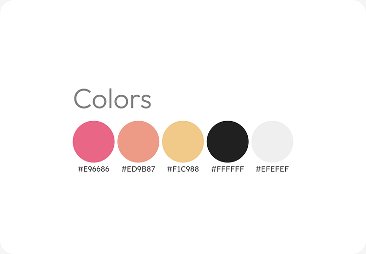
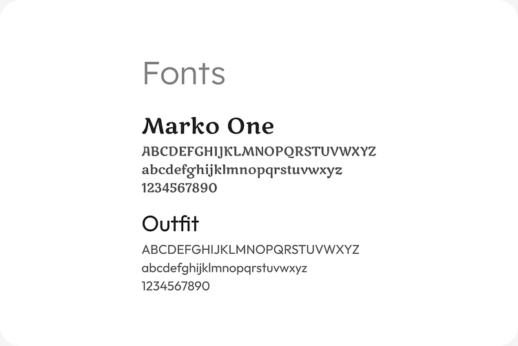
In order to represent the key features of Becky, simplicity, performance and intuitiveness, we opted for a warm color palette and an elegant/playful font.
Accessibility
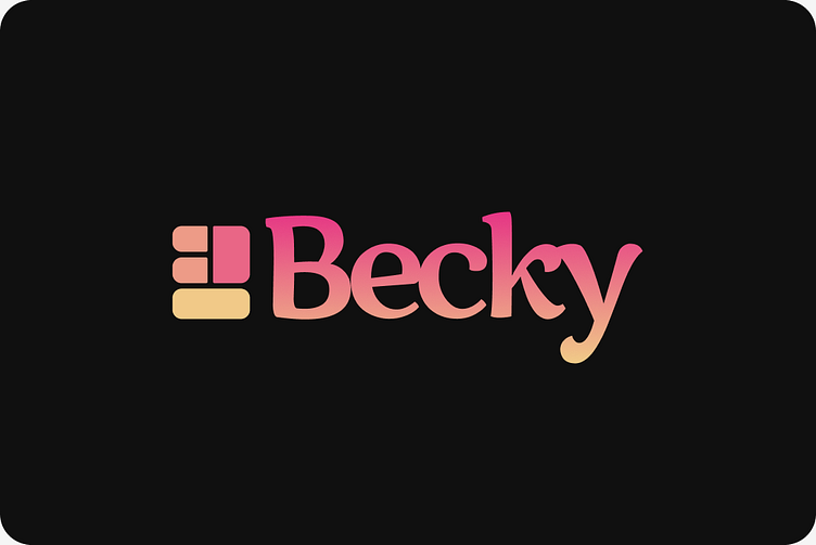
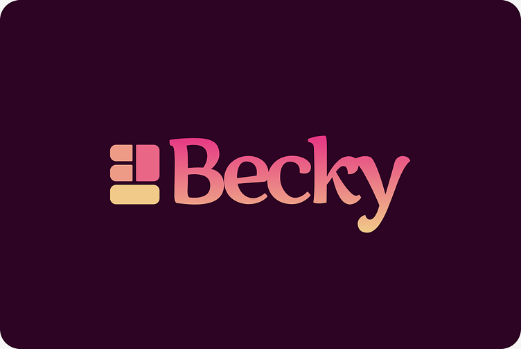
The logo fits perfectly on dark and light backgrounds, a key factor for an application forecasting to include light and dark themes. We defined style for dark colors background
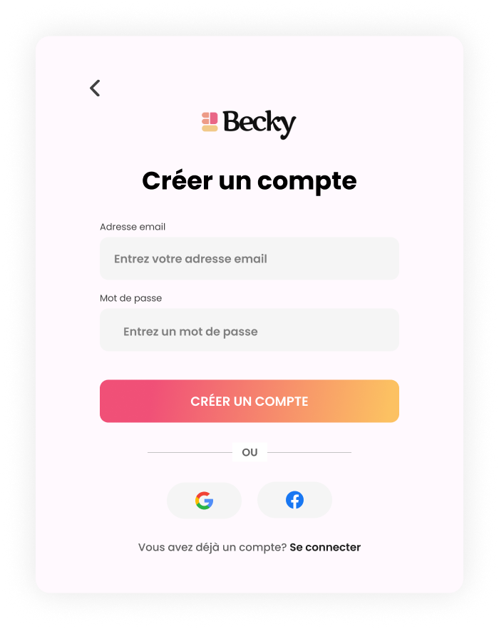
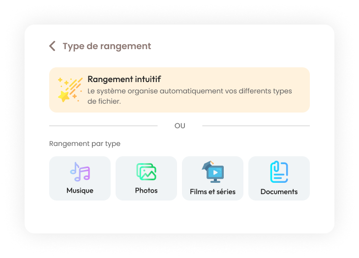
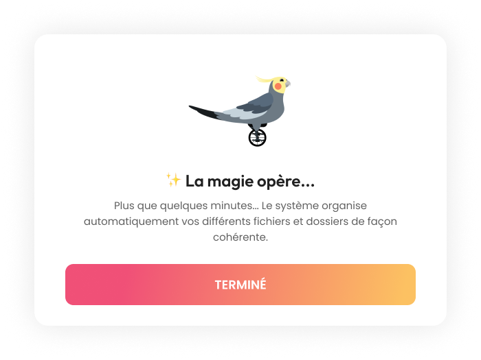
Some interfaces
Feel free to leave me feedback. Press (L) if you like.
