LeRemitt Home Page Redesign: Improving User Experience
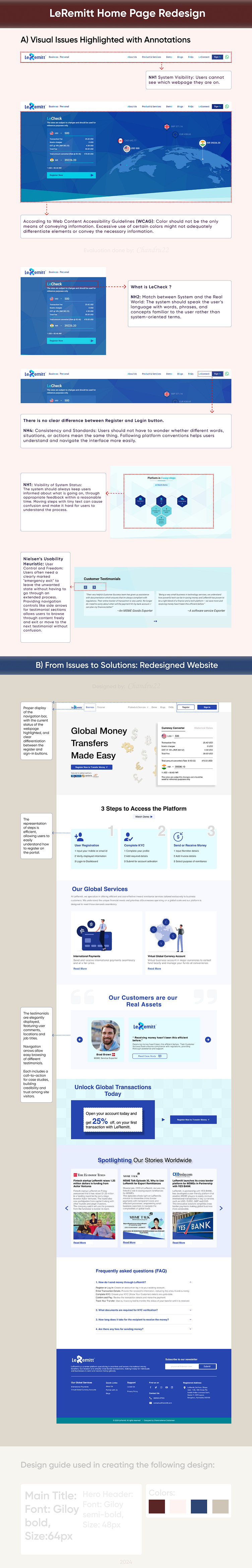
Description: The redesign of the LeRemitt homepage focuses on improving user experience and accessibility, adhering to industry standards and guidelines. The updated design addresses critical usability issues identified in the previous version, such as unclear navigation, poor text contrast, and lack of user-friendly elements.
Key Improvements:
Clear Navigation: Improved differentiation between "Register" and "Login" buttons.
Enhanced Readability: Compliance with WCAG 1.4.3 (Contrast Minimum) ensures better text visibility.
User-Friendly Interface: Consistent terminology and clear instructions follow WCAG 3.3.2 (Labels or Instructions).
Accessible Content: Alt text for images and proper focus order for interactive elements.
Impact:
Bounce Rate Reduction: The redesign has significantly lowered the bounce rate, indicating improved user engagement and satisfaction.
Positive Feedback: Users have reported a more intuitive and seamless experience, enhancing their overall interaction with the platform.
Laws and Guidelines Followed:
Nielsen’s Usability Heuristics: Consistency and Standards, Match Between System and the Real World, User Control and Freedom, Visibility of System Status.
Web Content Accessibility Guidelines (WCAG):
Non-text Content
Contrast (Minimum)
Focus Order
Link Purpose (In Context)
Headings and Labels
Labels or Instructions