Sprocket AND 1.3.3 OS Consistent Dialogs
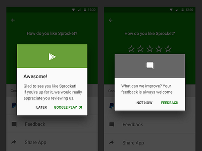
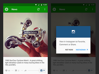
In order to achieve maximum in-app consistency I have chosen to style in-app dialogs the same way as the K.L.M. OS dialogs I can't control. This creates more trust in my bicycle services and makes all of the apps dialogs UI easier to maintain going forward (+ I was able to code the behavior and look-feel in 1.3.3 from vanilla source material).
Adding a context-appropriate color and token gives faster feedback and conveys a richer visual meaning to the proposed interaction. For example: dialogs about Instagram use IG-brand purple and camera icon and an edge case dialog to download the Google PDF Reader is red with a PDF icon. I have made these banners a consistent element throughout the Android app and a crossplatform consistency feature in the iOS Sprocket design as well.
Javier Santos @fjaviersantos let me know he made a Library for this, for you all! :D
https://github.com/javiersantos/MaterialStyledDialogs


