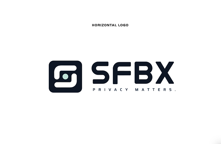
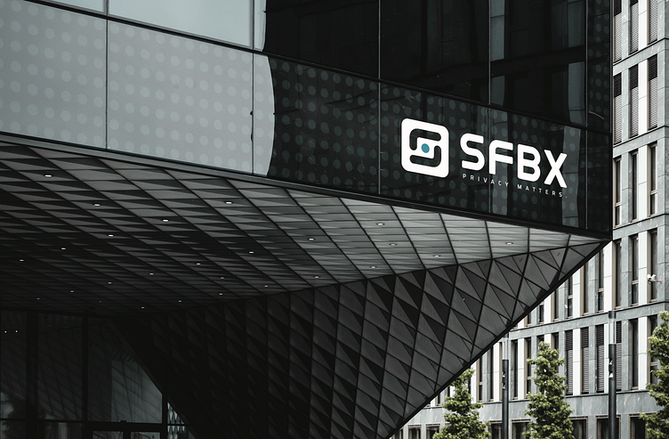
Brand Identity - SFBX

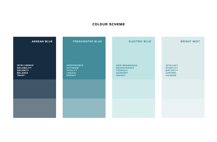
This rebranding project for SFBX was developed for an established France-based data consent firm. The client requested a modern brand refresh that represented data transparency at its core.
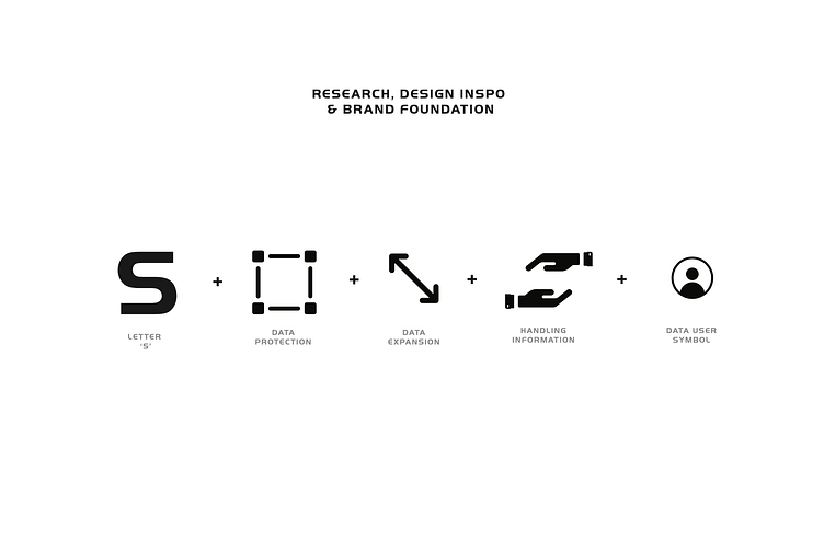
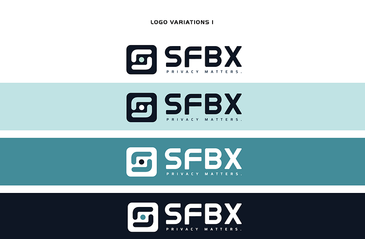
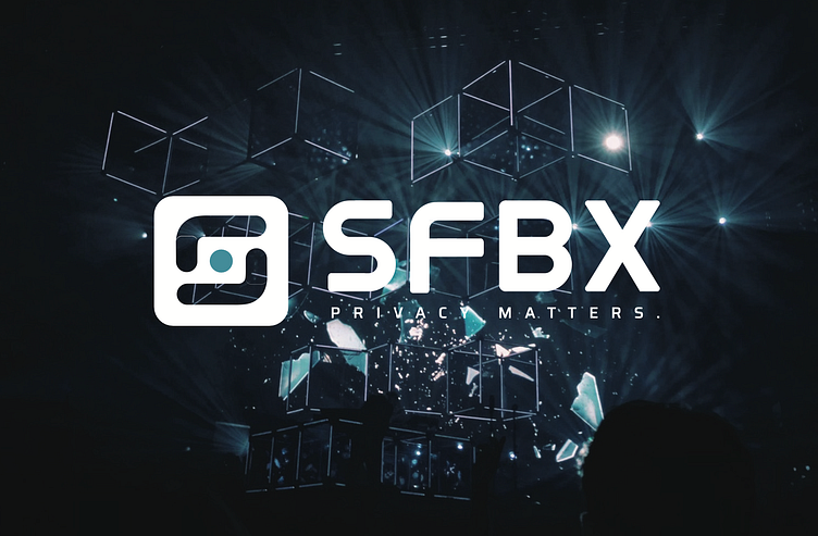
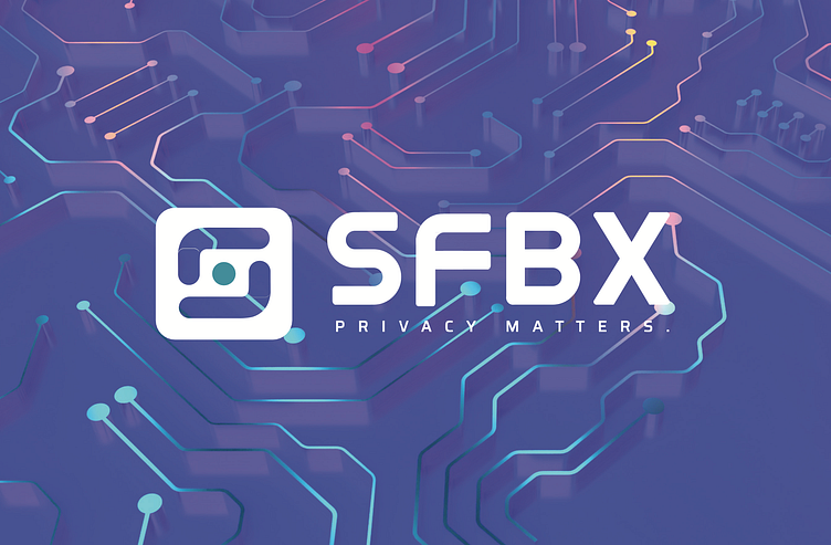
I developed a brand that encapsulated the letter "S", the boundaries of data protection and handling, with users' safety at its core. In this case, a data point is represented as the sphere at the centre of the logo, with an "S" letter formed out of 2 hands protecting the data. These hand symbols are consistently-transparent to their background, promoting the firm's core beliefs of user-centricity and safety.