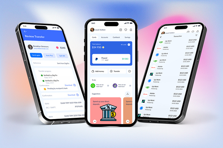
Fintech App Screen UI Design.
Home Screen
The Home screen of our Fintech app is designed with user convenience and clarity in mind. It provides a comprehensive overview of the user's financial status at a glance. Key features include:
Balance Overview: A clear display of the user's current account balance and available funds.
Quick Actions: Easy access to frequently used actions such as transferring money, paying bills, and viewing transaction history.
Recent Transactions: A scrollable list of the most recent transactions for quick reference.
Personalized Insights: Financial tips and insights tailored to the user's spending habits and goals.
Transaction Screen
The Transaction screen is where users can manage their financial activities efficiently. The design focuses on simplicity and ease of use:
Transaction Form: An intuitive form for entering transaction details, including the recipient's information, amount, and description.
Category Selection: Easy categorization of transactions to help users track their spending across different categories.
Confirmation: A clear confirmation step to review transaction details before submission, ensuring accuracy and preventing errors.
Status Updates: Real-time updates on the status of transactions, keeping users informed every step of the way.
Review Screen
The Review screen allows users to reflect on their financial activities with detailed summaries and insights:
Transaction Summary: A detailed breakdown of all transactions within a selected period, including categories and amounts.
Spending Analysis: Visual charts and graphs that help users understand their spending patterns and identify areas for improvement.
Monthly Review: An overview of monthly financial performance, comparing income and expenses to previous periods.
Feedback and Suggestions: Personalized tips and suggestions based on the user's financial behavior, helping them to manage their finances better.

