An update

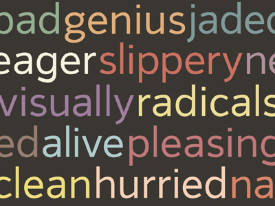
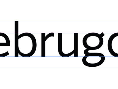
Last week, I spent a bit of time making revisions to the early stages of a typeface started absolutely ages ago. While these are mostly small changes and the lowercase isn't even finished, I wanted to get a better idea of what it could look like in blocks and with some colour.
Over the last couple of days, I've been thinking more about what direction I'd like to take with this, as I also half-started a script font more recently. Lately I've found myself increasingly disillusioned with both projects, neither of which are particularly progressing. I've taken a more rigorous critical view with regards to the purpose and aims of the design and I think that's where the problem (and solution) lies.
I did of course plan out goals for this typeface, but they were primarily stylistic: something clean, solid, highly legible with humanist qualities for some warmth and personality. While I do still like the overall look, the intended use was also quite generic and I don't feel it would add anything new to the many successful existing typefaces of a similar style.
I'm planning some further brainstorming and research to develop an idea with a stronger concept, something that I'll be motivated to work on for long periods of time and that's more suited to me. Like Jonathan Barnbrook wrote, "drawing and releasing a typeface means you have shaped a new voice that is uniquely yours with which to speak to the world on your own terms."
(I realize this is an absurdly long comment, but it helps to make decisions to write things down)