Fully Responsive Figma UI Library for TMS!
Creating seamless user interfaces has always been more complex. Our comprehensive UI kit is designed to streamline your TMS(Task Management System) process and enhance your projects. 🚀
This TMS UI kit offers a comprehensive range of elements, including a variety of buttons, icons, selectors, badges, and typography, for a seamless development and design process. ✨
Here's what you get:
🎨 Component Variety:
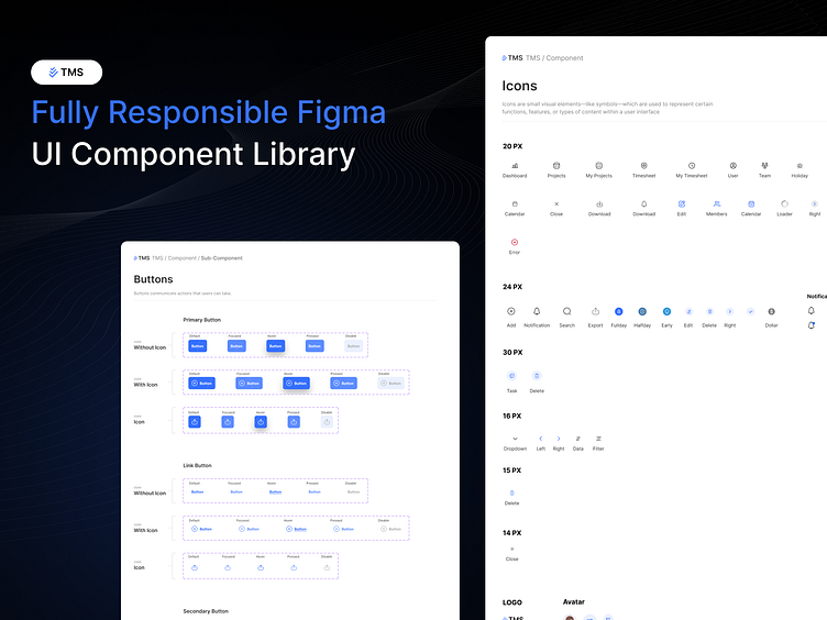
Buttons: A wide range of primary, secondary, and link buttons with and without icons.
Icons: Scalable icons in various sizes (14px, 15px, 16px, 20px, 24px, 30px) for every need.
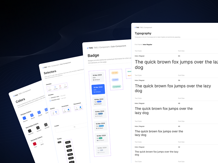
Selectors: Checkboxes, switches, increment/decrement buttons, and more.
Badges: Dynamic badges to highlight important information.
Typography: Consistent text styles to maintain visual harmony.
📋 Detailed Components:
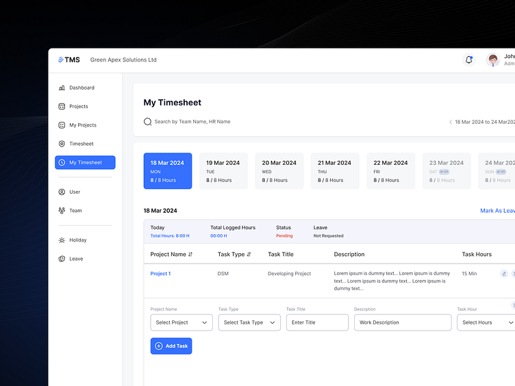
Timesheet Management: User-friendly layout for tracking project hours and tasks.
Selectors & Inputs: Smooth interactions for an effortless user experience.
Loaders & Tooltips: Improve the usability and feedback of your interface.
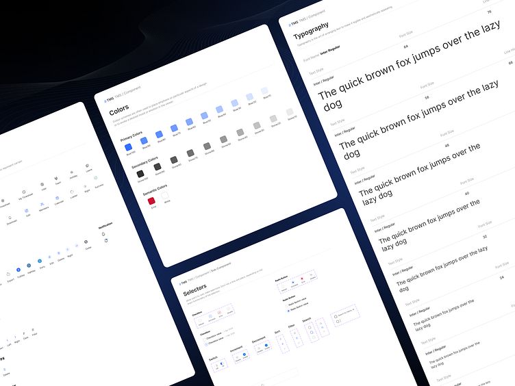
🌈 Color Palette:
Primary, secondary, and semantic colors are thoughtfully chosen for versatility and accessibility.
🔥 Why Choose Our UI Kit?
Responsiveness: Adapts beautifully to all screen sizes and devices.
Scalability: Every component is designed to be easily customizable and scalable.
Efficiency: Speeds up your design workflow, saving you time and effort.
Check us more at :
Press ♥️ If you like it.