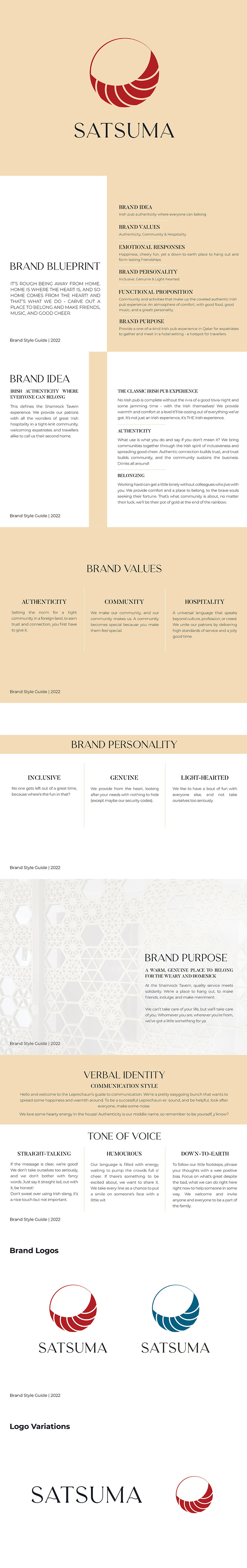
Logo and Branding Design for Satsuma
Satsuma as a restaurant focused on East Asian dishes, especially sushi, was looking for a well-defined logo to present its brand to its finest. They were thinking about creating a full brand, so from the first steps, it was important to think about how the rest of the brand guidelines could be affected by the logo.
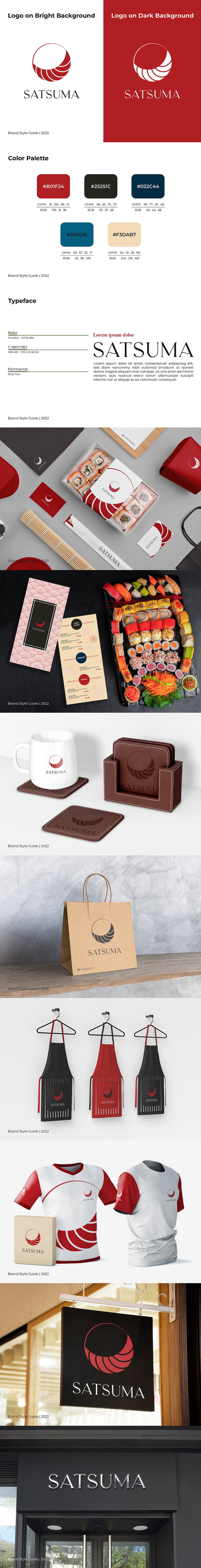
Food-related brands, especially on the East Asian side such as Japan, have a key point: using the color red for the design. It both showcases their nationality and culture and it’s also the most appetizing color known for food-related brands.
The final look of the logo after trying different directions was presenting an abstract concept of sushi on a circular plate. A minimal yet representative design that with one look you could understand what the business indicates.
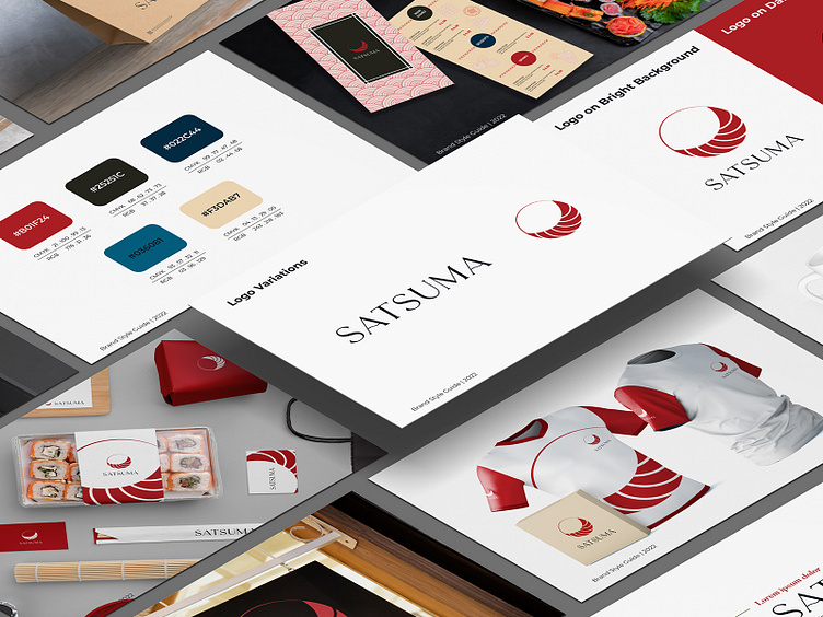
Also, it was important to use a font for the brand name that can showcase the soft and friendly essence of the restaurant. After finalizing the logo the brand design started. From showcasing the brand idea, values, visions, etc. to more graphical guides such as logo usage, color palettes, and fonts. Then stationery designs were on the list of designs. Packages for takeouts, business cards, menus, aprons, and all merchandise were designed to make sure the restaurant would have its full vibe.
Contact us today for your unique logo and branding designs!