Fortress Solar Energy Logo Design
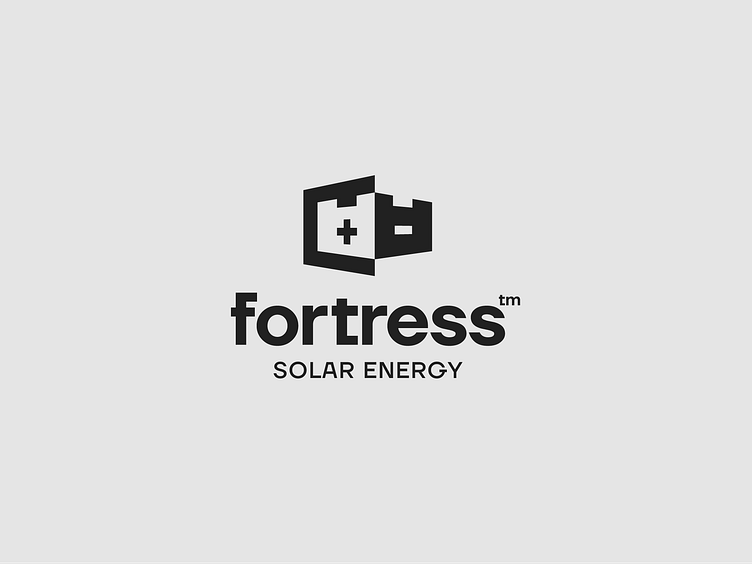
The logo design I created for "Fortress" solar energy company encapsulates several key elements that reflect both the technical and visual aspects of the business.
The main concept behind the logo is inspired by the polarities inherent in solar energy systems, which operate using connectors that are polarized, with one gender representing the positive and the other the negative. This duality is visually conveyed through the use of positive and negative space within the logo.
Moreover, the design subtly incorporates the silhouette of a castle or fortress, symbolizing the robust and reliable nature of the solar panel systems. Just as a fortress stands strong and resilient, the solar panel systems are installed for large commercial and residential properties that are designed to be durable and dependable.
The combination of these elements—polarized connectors and the fortress silhouette—not only highlights the technical foundation of solar energy but also communicates the strength and stability of the installations. This dual representation ensures that the logo is both visually appealing and meaningful, resonating with the core values and strengths of the company.
By integrating these concepts, the logo effectively portrays your Fortress's commitment to providing powerful, reliable, and efficient solar energy solutions.
Please feel free to leave your thoughts!!! #logodesign #solarenergylogo #solarpanelcompany
