Social Media to read Artick
I've embarked on a 20-day journey to push my design skills to the next level. Not only am I creating web and app pages on Figma, but I'm also animating the wireframes and mock up! 🚀
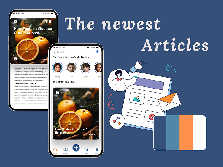
Day one and I'm designing and animating two pages for a social media app where users can read the latest articles. Using blue, orange, and white in a social media app creates a visually appealing and user-friendly interface. Blue fosters trust and focus, orange adds energy and drives engagement, and white ensures clarity and readability. This combination helps maintain a balance between a dynamic, engaging experience and a calm, professional atmosphere, making it ideal for social media applications.
At the end of this video I also show you the way I have navigated the pages.
By the way do you like the design? do you have any idea?
Stay tuned for updates on my progress and insights from this creative challenge! 🎨✨