Lannock

Typography
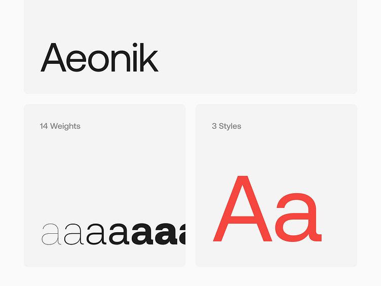
With Modernist roots but details referencing mechanical early Grotesks, Aeonik positions itself as a Neo-Grotesk with a Geometric skeleton; with proportions that are wider than a typical Grotesk, but thinner than a typical Geometric Sans. Structurally, this creates a fantastic balance for both display and text use.
Full Case Study on Behance 🤘 https://www.behance.net/gallery/196034489/Lannock