WYVERN Drone delivery app - Redesign

What is the purpose of the project?
When I first jumped into UX design I began my education through Google's UX Designer course through coursera. I created 3 full design projects during that time and learned a great base amount of knowledge through that certification.
However, looking back now about 2 years later I decided to reiterate on my first design project.
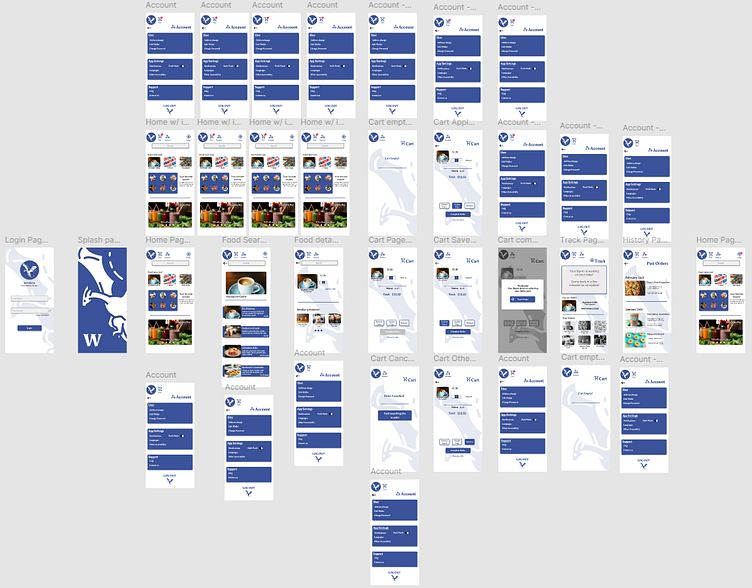
What is the project?
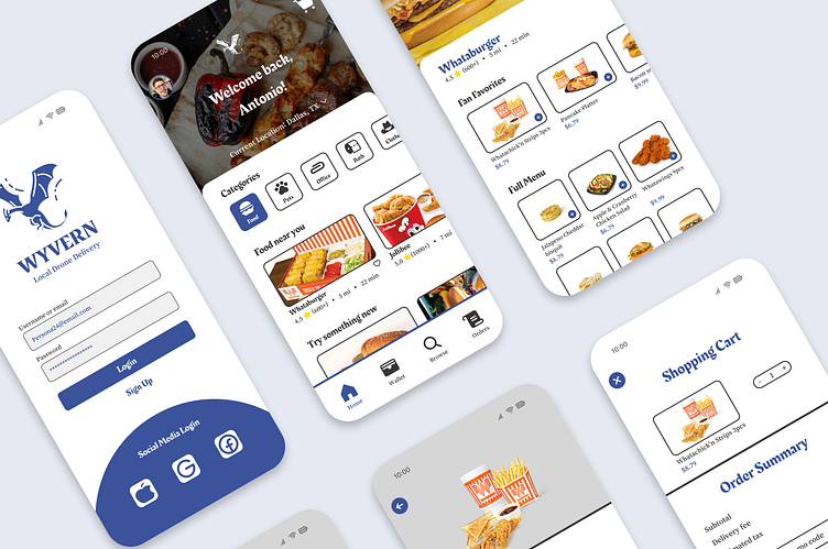
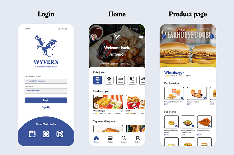
WYRVN is a delivery app that focuses solely on delivery by drone.
Focusing on not only food delivery, but for any local items you may need while you are at home, visiting out of state or in the office.
What changed?
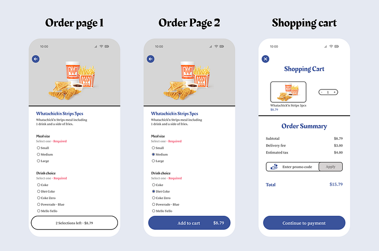
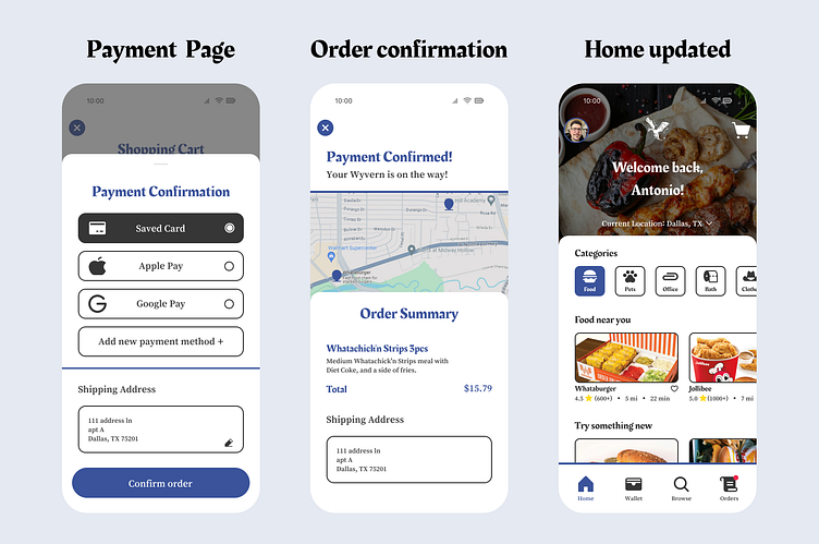
- Cleaning up design flow by focusing on 1 flow at a time
- Updated UI so that it follows current UX patterns delivery apps use
- Updated app name from WYRVN to WYVERN
Tools Used:
Figma
Test the prototype here:
What did the Designs look like before?
Here are references to the past design
Test the old prototype here:
Thank you for reading!
Let me know what you liked, didn't like, and what you would changed! :)