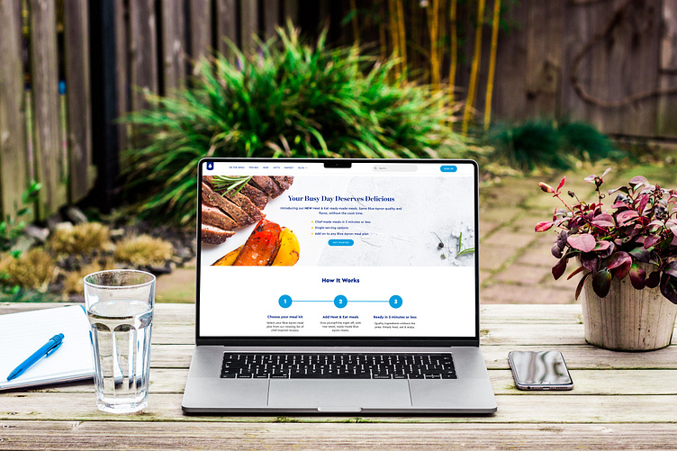
Blue Apron Heat & Eat Page
Overview:
For Blue Apron, I designed the Heat & Eat page, which focuses on their ready-to-eat meal options. The goal was to create a visually appealing and user-friendly page that highlights the convenience and quality of Blue Apron’s Heat & Eat meals, catering to busy individuals and families looking for quick, healthy dining solutions.
Scope:
Design Concept: Developed a clean and engaging design concept that aligns with Blue Apron’s brand identity, emphasizing ease of use and the appetizing nature of the Heat & Eat meals.
Visual Elements: Incorporated high-quality images, clear typography, and intuitive layout to guide users effortlessly through the page.
User Experience (UX): Focused on creating a seamless user experience with easy navigation, clear calls to action, and responsive design to ensure optimal performance across all devices.
Content Integration: Integrated compelling descriptions, nutritional information, and user reviews to provide comprehensive information about the Heat & Eat meals.
Client Collaboration: Worked closely with Blue Apron’s marketing and product teams to ensure the page met their goals and adhered to brand guidelines.
Results:
Enhanced Engagement: The new Heat & Eat page design has successfully captured user interest and increased engagement with the meal options.
Increased Conversions: The clear calls to action and user-friendly layout have contributed to higher conversion rates and customer satisfaction.
Positive Client Feedback: Received positive feedback from Blue Apron for the design’s effectiveness in promoting their Heat & Eat meals and enhancing the overall user experience.
Tools Used:
Adobe Photoshop
Adobe Illustrator
Figma
Conclusion:
The Blue Apron Heat & Eat page project showcases my expertise in crafting engaging and functional web pages. By focusing on user experience and visual appeal, I successfully highlighted Blue Apron’s convenient meal options, resulting in increased customer interest and higher conversion rates.

