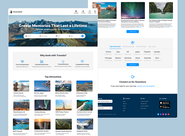
TRAVODO: Adventure Booking Site Design
🌕Hello Dribbble!
Hi, I am Ko, an aspring designer from Japan! Please check out my adventure booking site design, TRAVODO. I'd love to know what you think?
Project Details(Fictional Project)
Client Goal
The aim of the TRAVODO project was to design an attractive and functional adventure and tour booking website. The client's goal was to create a platform that allows users to easily search and book tours based on their preferred destinations and activities. The website needed to offer a seamless user experience with features like detailed tour descriptions, trusted reviews, competitive pricing, and beautiful visuals to inspire and engage users.
My Contribution
As the lead designer for the TRAVODO project, my contributions included:
1. Logo Design: I designed the TRAVODO logo to reflect the adventurous spirit of the platform. The logo was crafted to be both memorable and aligned with the website’s aesthetic and theme.
2. User Interface (UI) Design: Using Figma, I created a visually appealing and user-friendly UI. This involved designing intuitive navigation, clear calls-to-action, and ensuring that all elements were easily accessible and organized.
3. Icon Selection and Modification: I carefully selected and modified icons to match the website’s theme, ensuring consistency and enhancing the overall user experience. The icons were chosen to clearly represent different functionalities and features.
4. Visual Content: I sourced high-quality images to enhance the website’s visual appeal. These images were strategically placed to inspire users and give them a glimpse of the exciting adventures they can book through TRAVODO.
5. Feature Integration: I integrated essential features such as destination and activity filters, tour listings, and booking options. This included designing sections for top attractions, curated adventures, and user reviews to provide comprehensive information and build trust with users.
Project Success
The TRAVODO project was a conceptual success, showcasing my ability to design a compelling and functional tour booking website. The design was well-received for its aesthetic appeal, organization, and user-friendly interface. Although the project remains a conceptual design, it demonstrates my expertise in creating engaging and effective digital solutions for the travel industry.
📓Initial Sketch for the Design
Below is the rough sketch I made for the design this time.
⭐️Looking to hire a junior designer at a competitive rate? Let's talk.
If you are looking for a junior designer at a competitive rate, please let me know. I'd be happy to work. Feel free to message me:)

