Hestia Architecture - Visual Identity

Héstia Architecture is an office that performs residential, commercial and sports architecture projects. The purpose of the brand is innovation and creativity in the projects and other services it offers. The challenge was to design an authentic brand that expresses seriousness, solidity, commitment and professional maturity and that was linked to the brand name.
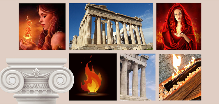
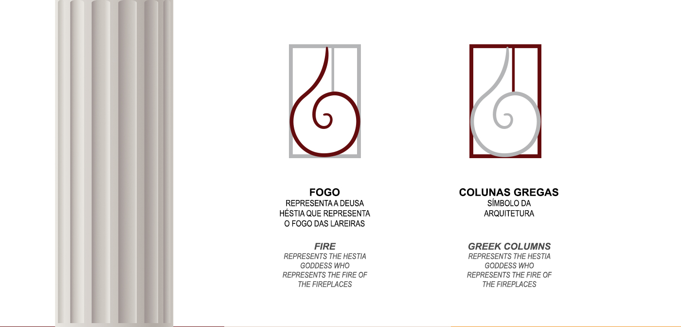
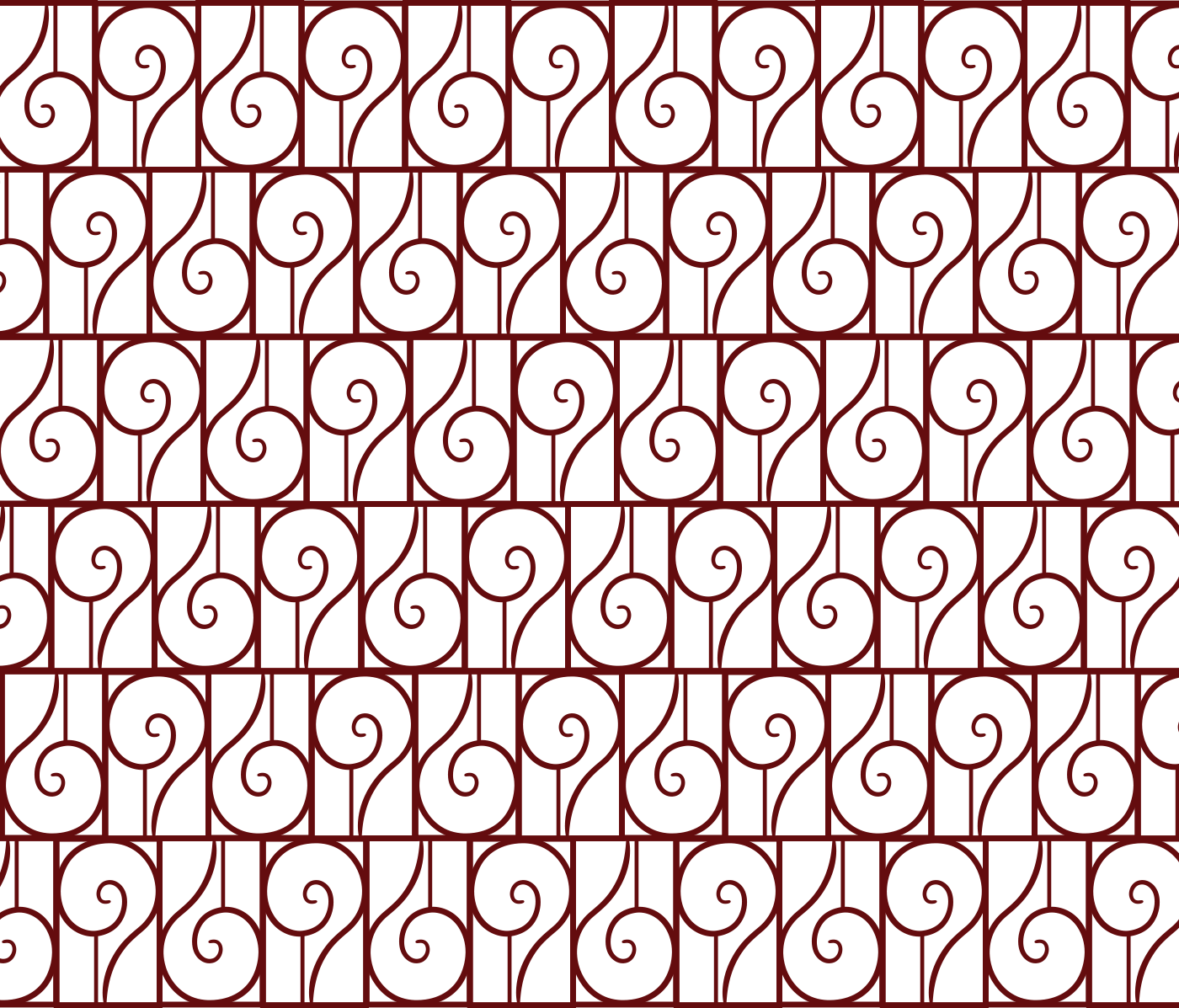
Based on the briefing, through semantic and conceptual analysis, we collected concepts such as history, fire, planning, people, columns, Greece and cosiness. For the construction of the symbol I used fire, because the goddess Hestia in Roman mythology is the divinity that represented the fire of the hearths, considered a protective goddess who illuminated and warmed by means of her fire, and pointed out as the goddess of the home, of the family and the city and also the Greek columns that first appeared in Greek architecture during the 7th century BC and reached their peak with the construction of the Parthenon.
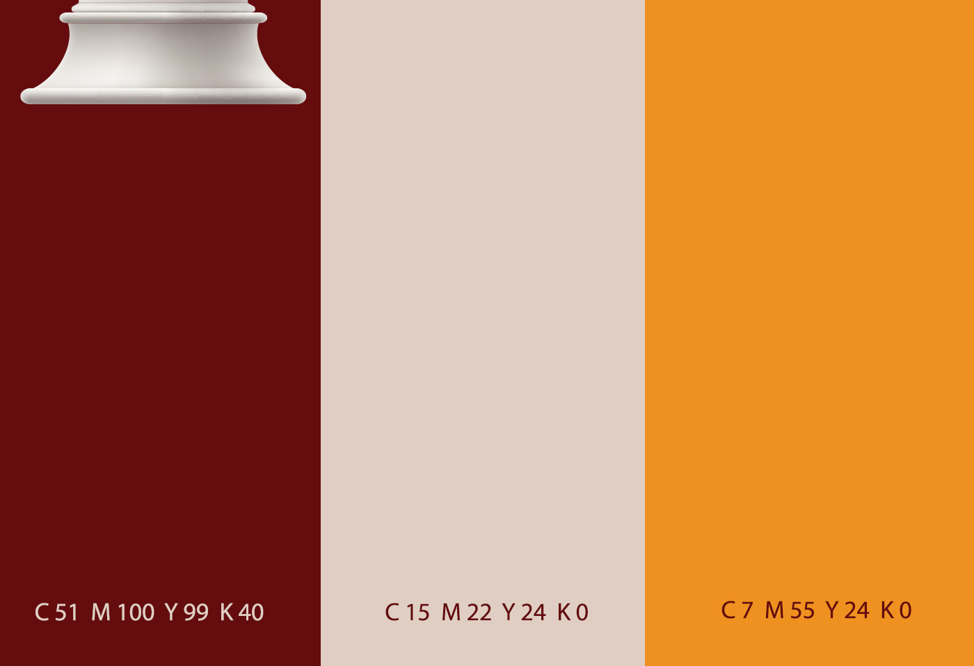
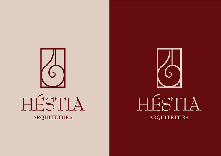
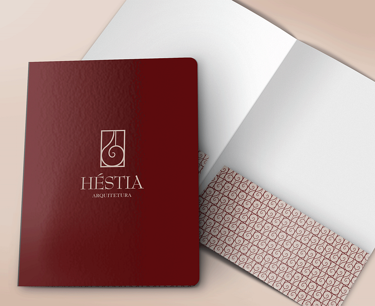
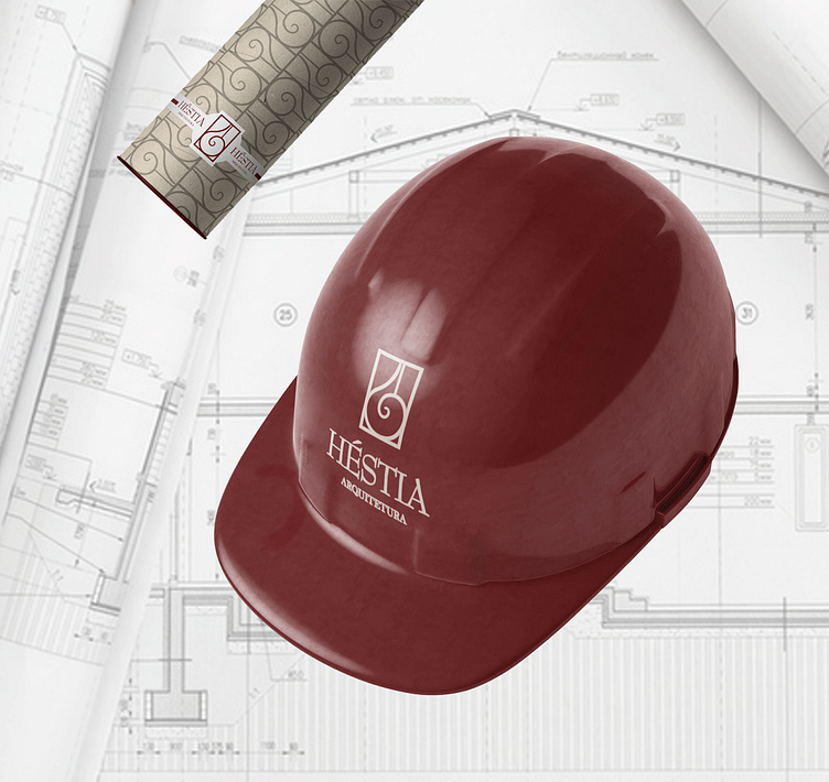
In the color palette, wine red was used to represent fire, nude to give contrast and gold to be used in detail. BaskervilleOld was used in the font, bringing legibility, solidity and its serifs resemble the bases of Greek columns.
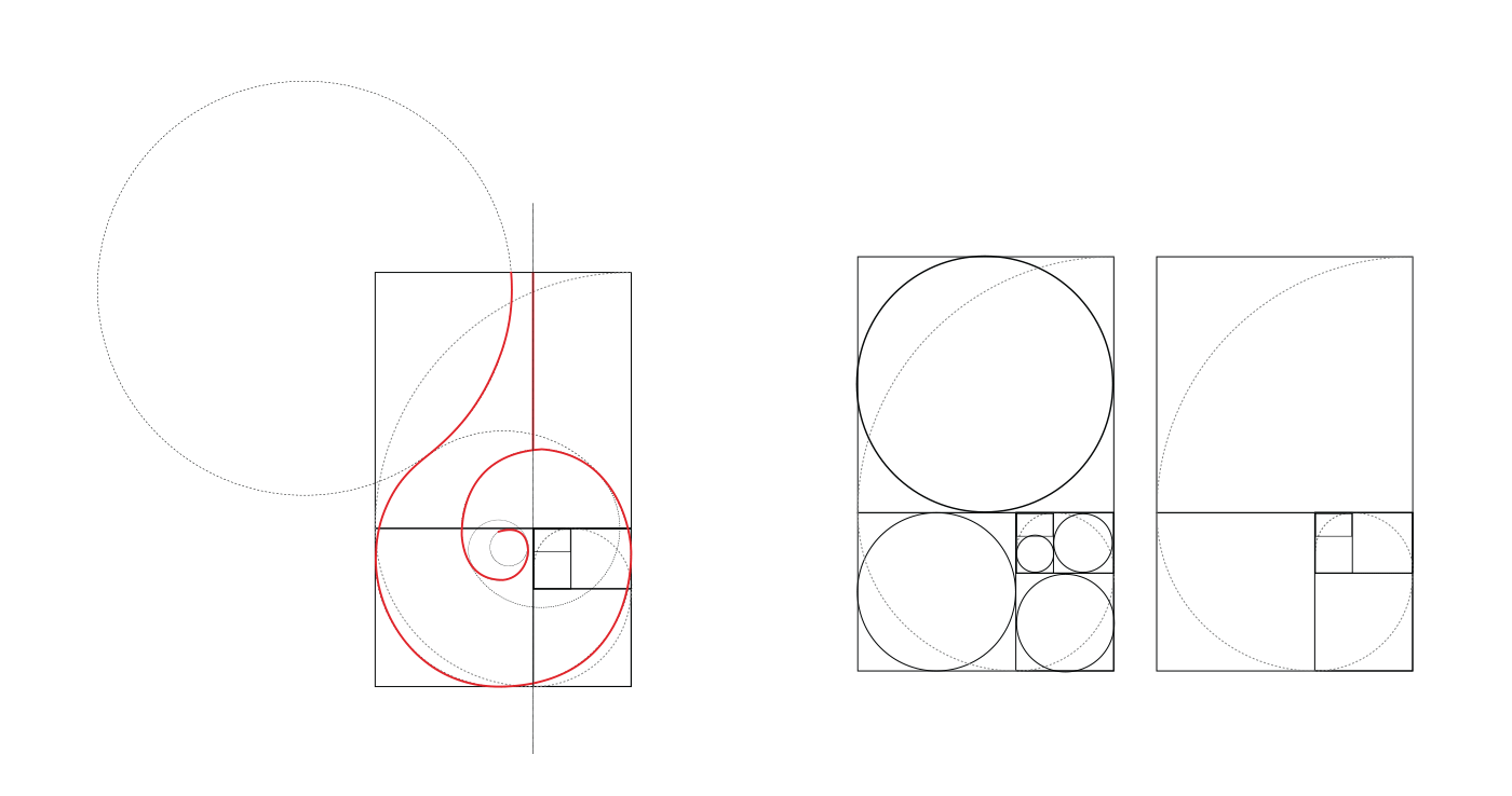
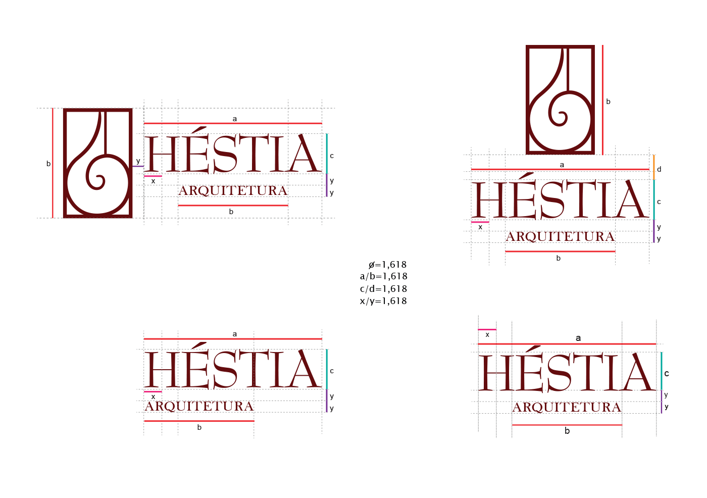
For this project I used the mathematical basis known as the Golden Ratio or gold number in the construction grid, bringing more harmony to the brand.