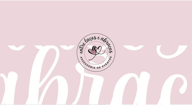
Entre Laços e Abraços - Visual Identity

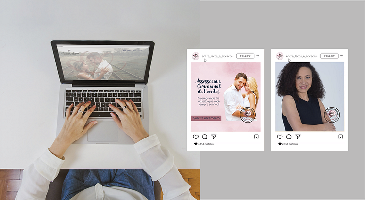
Entre Laços e Abraços, a company that provides consultancy and organization of social events such as birthdays, weddings and debuts, as well as corporate events such as conventions, fairs, leaders' meetings, social parties.
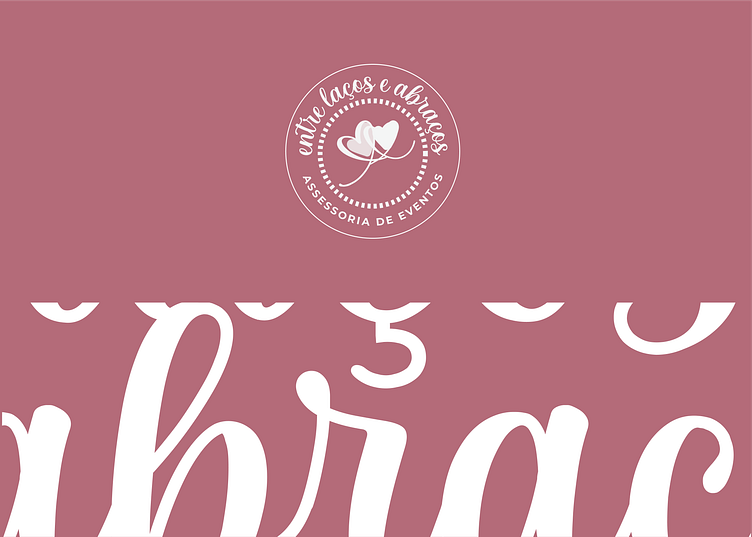
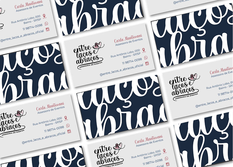
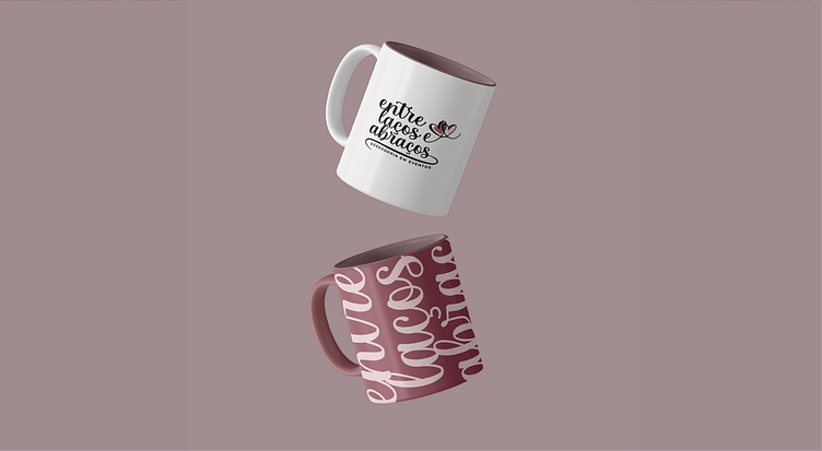
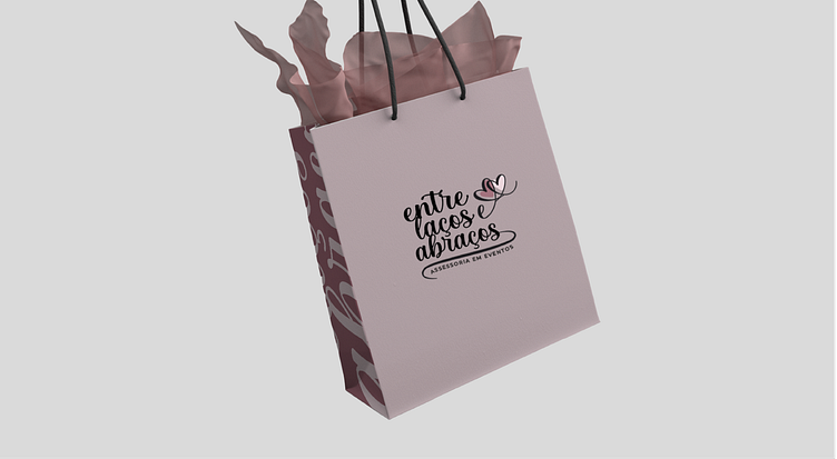
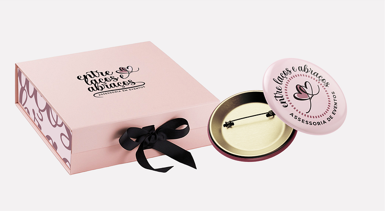
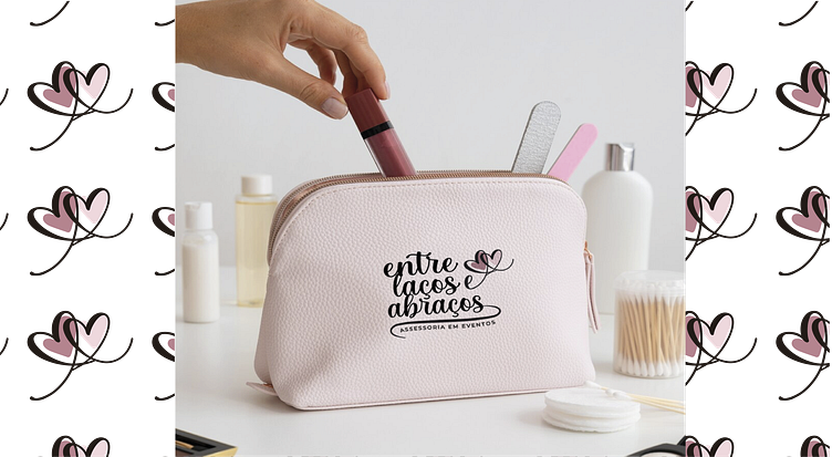
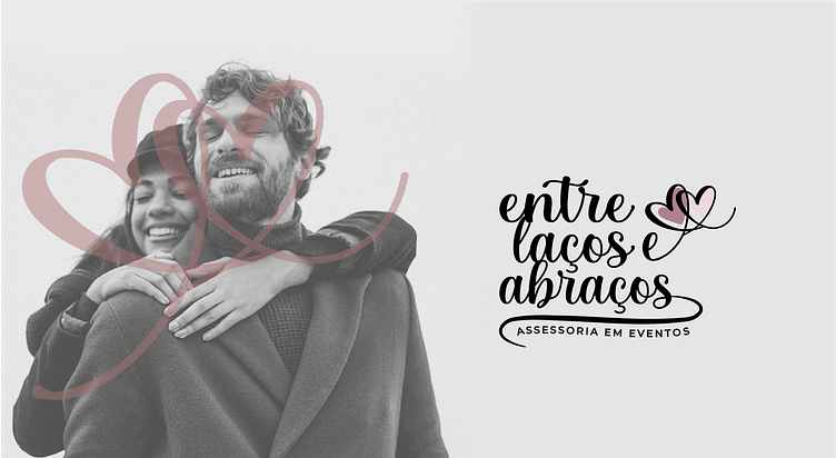
The symbol was designed exclusively for the brand, making it unique and totally authentic. The set expresses a delicate, creative, romantic and very authentic brand, all in accordance with the brand's archetype, a symbol and typography that embraces, which brings comfort and welcome.
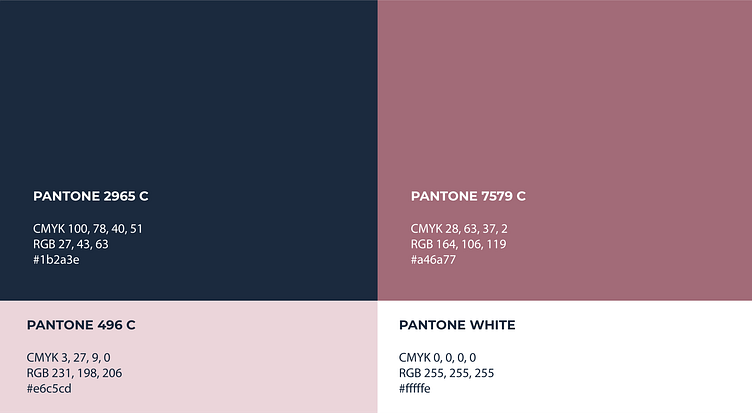
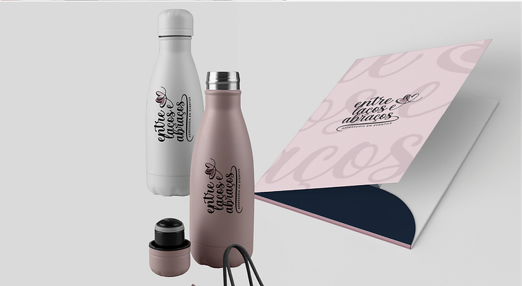
The colors used were pink, which symbolizes feelings linked to the heart, that is, it is linked to emotions, affection, joy and companionship, the lighter pink is linked to emotional health, security and understanding. It expresses tranquility, serenity, harmony and warmth, navy blue is associated with qualities such as trust, friendship, friendliness and loyalty, it also denotes professionalism, respect and wisdom and white symbolizes peace, purity and cleanliness. Timeless. It brings contrast with all colors and enhances the legibility of the brand. The main typography chosen to support the brand's communication and tone of voice was JosephSophia with some adjustments and in the secondary typography I used Montserrat Regular.