PAYMAN | Logo & Brand Identity


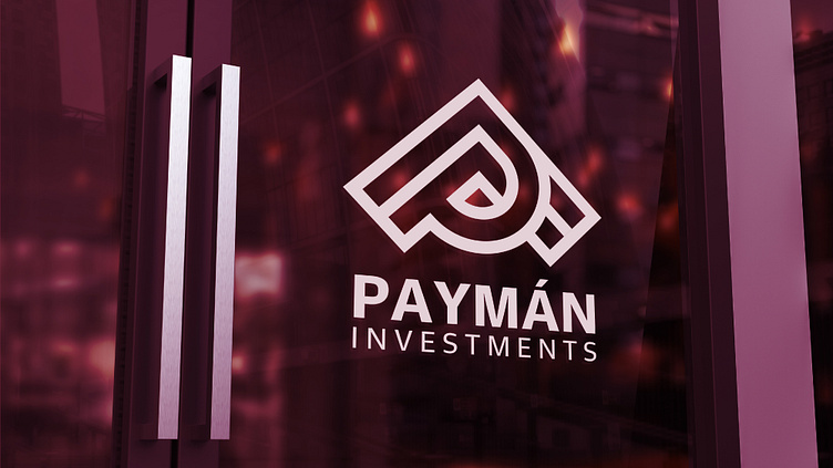
PAYMAN Company is an engineering company that operates in the field of hotel construction. The PAYMAN Company logo uses professional techniques to develop a unique concept that showcases the company's engineering and construction work. The logo effectively represents the brand's personality and identity.
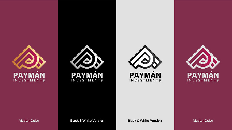
In the logo, the letter "P" signifies the beginning of the word "Payman" and is combined with an upward-facing arrow, symbolizing progress and moving toward the future. The shape at the top of the logo resembles the roof of a building, directly referencing the company's field of activity, which is hotel construction.
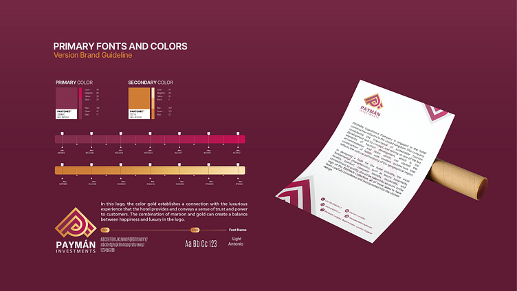
We chose the colors of the logo carefully. The purple color represents royalty and luxury, while the golden color symbolizes wealth and success. Gradient colors of purple and gold add beauty and attractiveness to the logo and enhance the sense of luxury and value, thus bestowing a luxurious and prestigious dimension upon the PAYMAN brand.
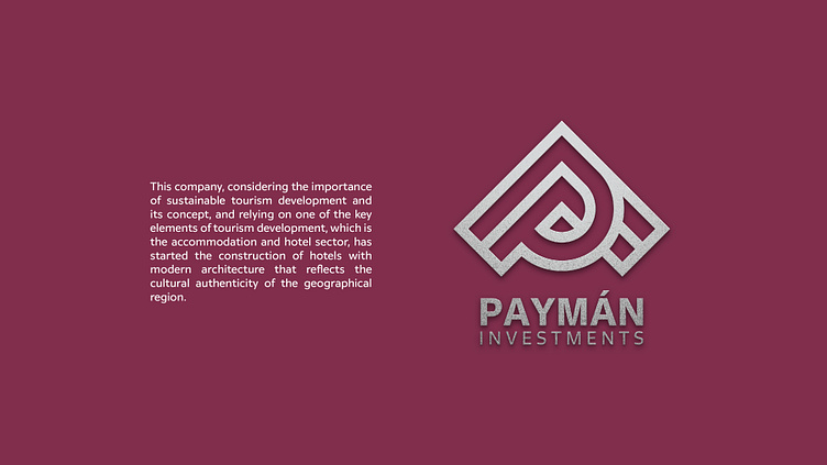
Hotel construction company
• Logo Tasarım ve Görsel Kimlik
• Logo Design & Brand Identity