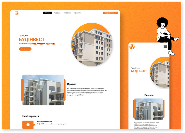
Minimalistic website for the building company UI / UX, WEB dev
Objective determined and provided by the client:
Create a minimalistic, modern, and professional website that showcases the company’s construction services, advantages, and expertise. The design should incorporate accent colors of orange and black to reflect the brand’s identity.
Hero section
Using clean and familiar for most users layout is aimed to bring them a sense of comfort. Image on the right is resembling the logotype by using ellipse form with a picture of a building that represents the buildings illustrated on a logotype.
More by Artem Diakunchak | UI/UX design, WEB dev View profile
Like

