Marie Harwood Design Brandboard

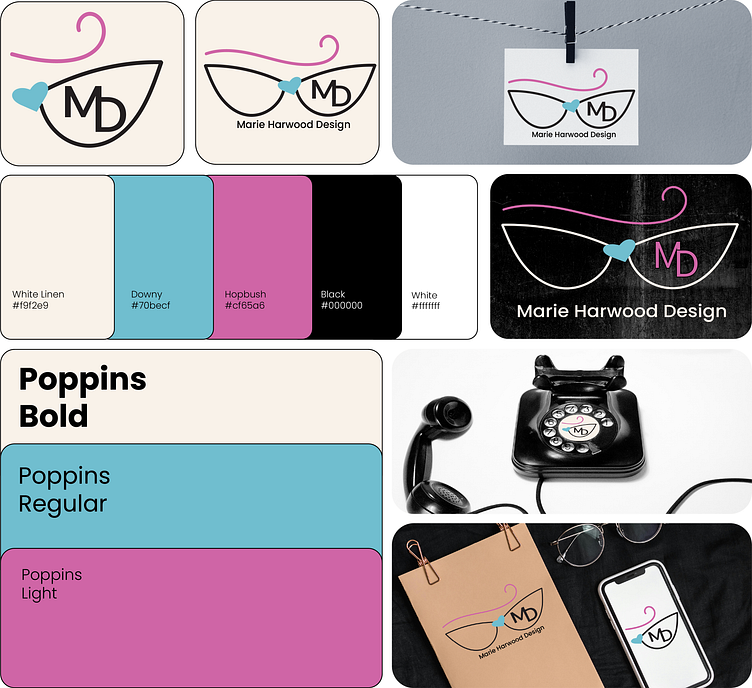
I created a brandboard for my own brand Marie Harwood Design, I based the brand on my glasses, which are cat eye and based on my love of all things mid-century.
Also my pink-red hair (always a shade of either these two colours), hence the pink for the hair, I have always been drawn to the heart shape, in the 1980's when I was kid there was a lot of clothing around with hearts on them in a variety of bright colours. I remember having some of these clothes as a child and I remember getting upset when I grew out of them.
The poppins typeface was used because it does have a retro 1960's/1970's feel to it and it reminds me of the typefaces I would see all around me growing-up. I first worked with poppins through my work as a graphic designer through RSASS as it is part of their brand kit.
I experimented with various typefaces but the simplistic retro style of poppins won me over.