Lexes Lab
About the project:
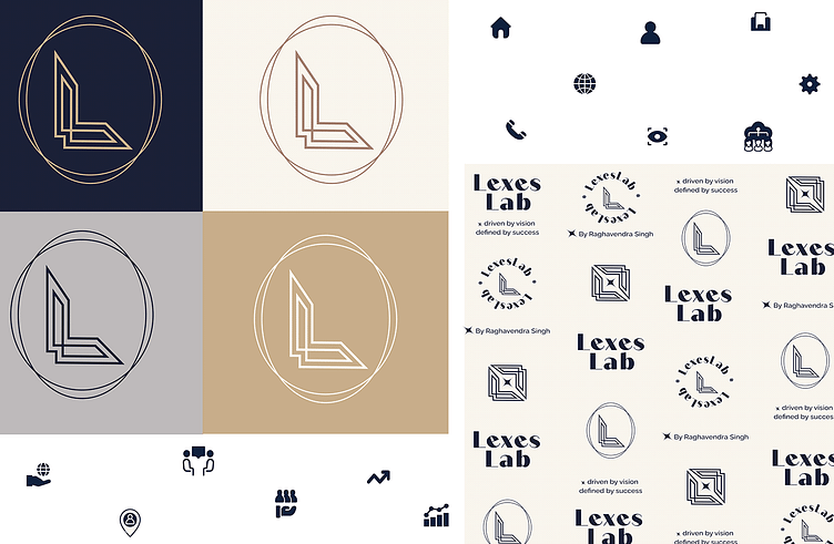
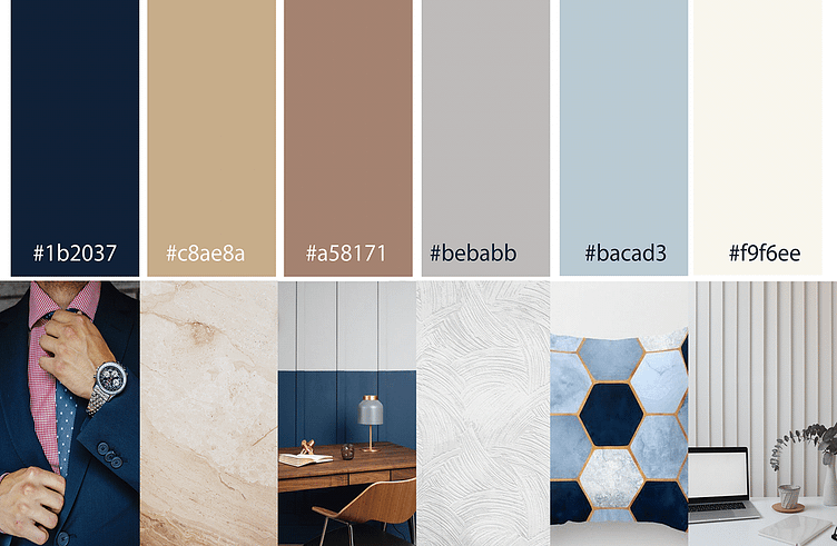
Lexes Lab is an organization that falls under the IT industry. They provide web solutions for the clients by building, updating and managing new websites. They desire to be a successful IT company. Lexes Lab is dedicated to provide high tech skills at a low price. The brand clearly indicates authenticity, exclusivity and luxury.
Task/Challenge:
This was my first real life client project. My task was to design the logo/logomark that is neither too masculine nor too feminine. The client needed it to be sleek, elegant yet luxurious and modern. To find the right balance was a challenge. The custom logo and logomark perfectly align with the brands values and personality.
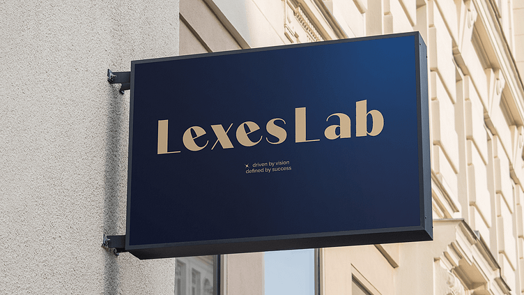
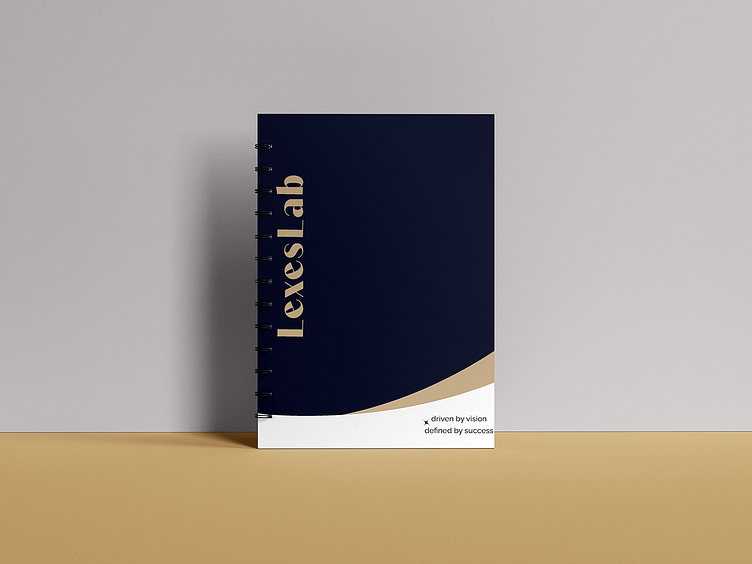
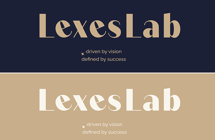
The design process for the Primary logo was to create a custom logo that stands with the brands vision of simple and modern design. Hence, to curate the most elegant font as the primary logo Quiche Sans is used. The type face was tweaked for a unique look. This creates a perfect identity to the brand.
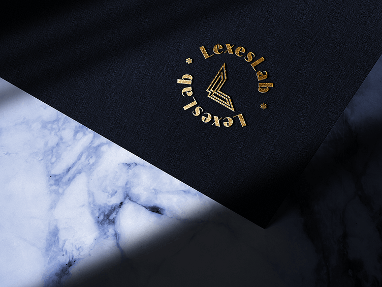
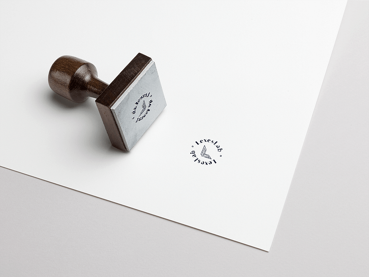
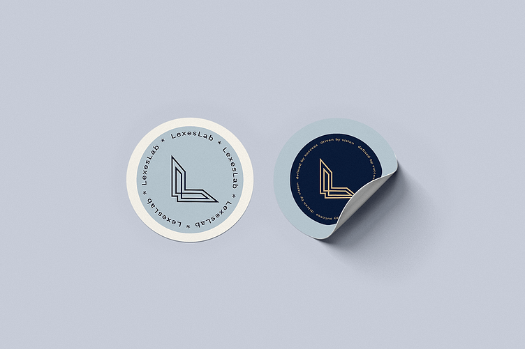
The logomark with the letter ‘L’ that creates a geometrical shape denoting growth or success. The concept development process was to create ideas using the letter ‘L’ as the shape for the logomark. I decided to incorporate the two ‘L’s’ in the brand’s name in an aesthetic way to create a distinct logo that is techie and unique.