🚀 Throwback to a UI/UX design I created for iMobilize! 🚀

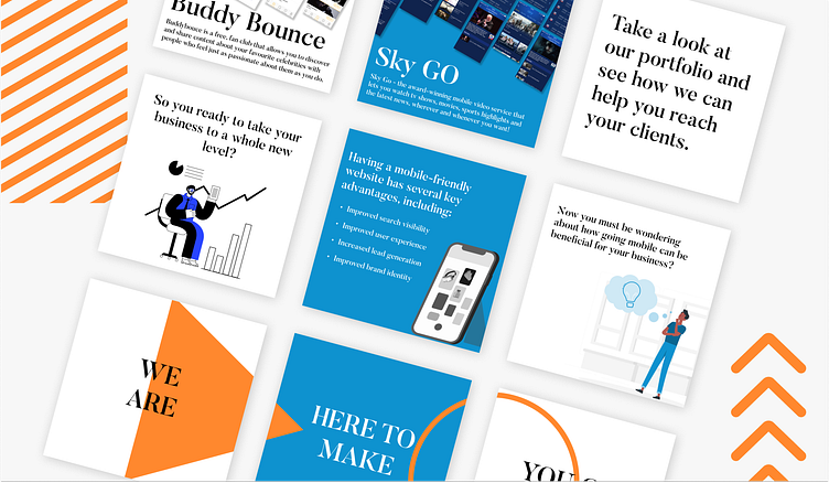
I'm excited to share a vibrant and user-friendly social media post design I crafted for iMobilize around 1.2 years ago. As a passionate and dedicated UI/UX designer, my goal was to bring their vision to life with an engaging and intuitive visual experience.
🔹 Color Palette Choice:
Orange: Represents energy, enthusiasm, and creativity, making the design feel lively and inviting.
Blue: Symbolizes trust, reliability, and professionalism, ensuring users feel confident and secure.
White: Provides a clean and minimalist backdrop, enhancing readability and focus on key elements.
Black: Adds a touch of sophistication and modernity, creating a striking contrast that highlights important information.
💡 I believe that good design is not just about aesthetics but also about creating a seamless and enjoyable user experience. I'm proud of this work and how it helped iMobilize's message stand out in the digital landscape.
#UIUXDesign #GraphicDesign #iMobilize #ColorTheory #CreativeDesign #UserExperience #VisualDesign #DesignInspiration #DesignerLife #InnovativeDesign