Checkout Page

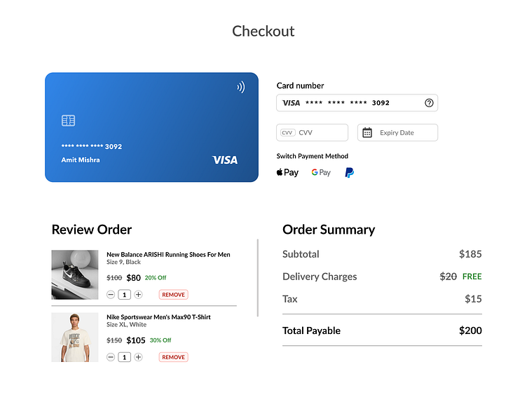


The goal was to create a checkout interface that not only looks clean but enhances user experience.
Here's what went into the process:Minimalism: I chose a straightforward layout to avoid any unnecessary distractions. Yet covering all the details and navigations requiredUser-Centric: Accessibility and readability were priorities. Notice the large fonts and clear labels?Seamless Navigation: Provided appropriate other payment methods if the user wants to switch to a different oneVisual Hierarchy: Strategic use of colour (green for user attraction) and space guides the user's eye naturally through tasks.
#Daily UI 002