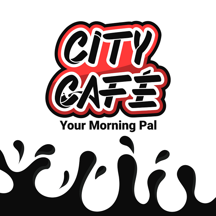
City Café Brand Identity Redesign

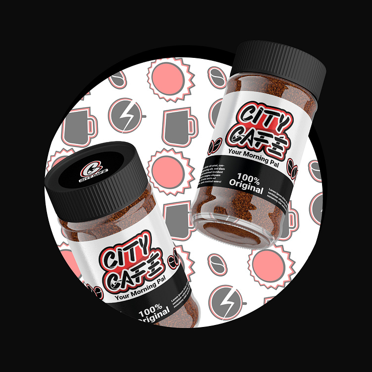
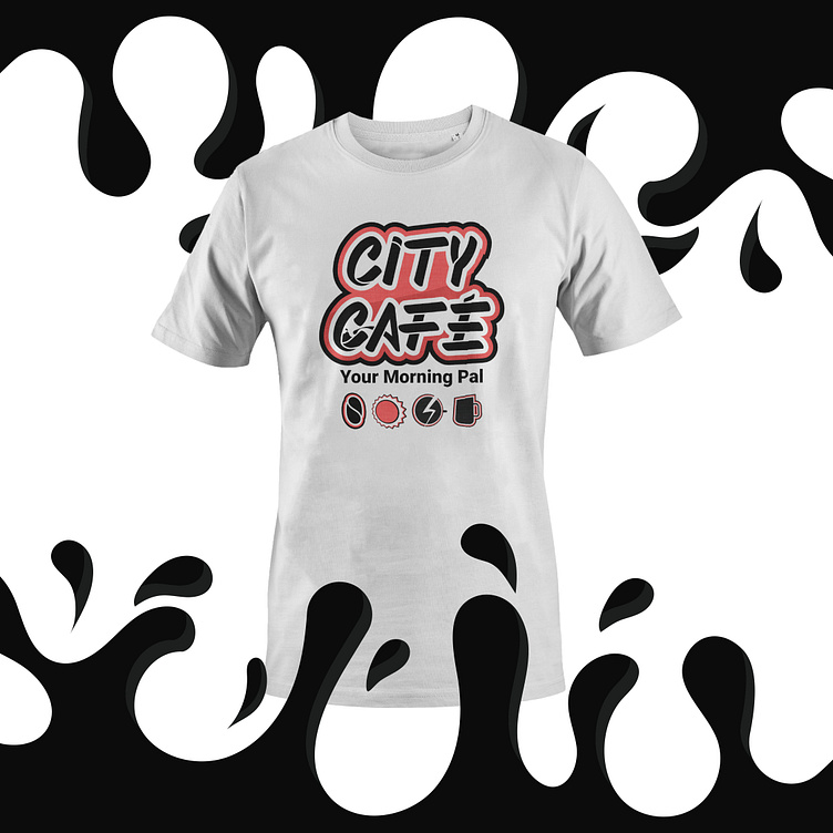
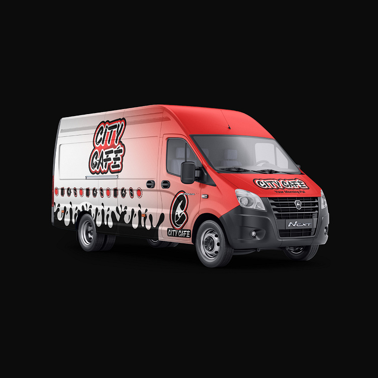
city café products are some of the most that i use on a daily basis, and i always thought that the brand identity doesn't speak to us (the target audience) in the right way because it always felt way too sophisticated and serious for the target audience which is teens and young adults (ages 15-30).

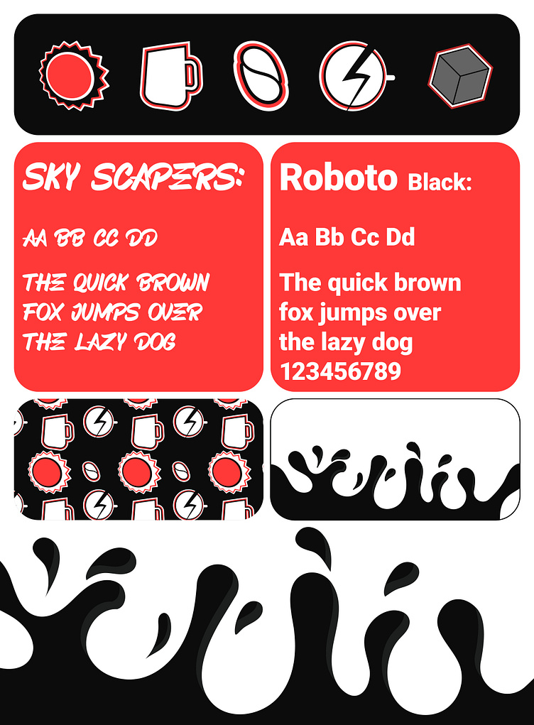
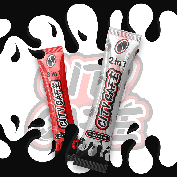
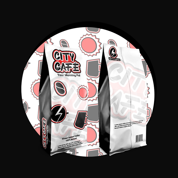
So for the redesign my thought process was to make the brand look more energetic and approachable to the target audience. that was achieved by redesigning the logo and incorporating logo variables which were missing from the initial brand design in addition to choosing fonts, colors, that convey the youth spirit of the brand, and adding illustrations and patterns to the mix made the whole brand look more approachable


please note that this is an unofficial redesign.
___________________________________________________________________
Let's take your brand to the next level.