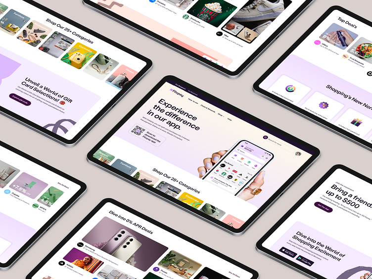
Flixpay - BNPL Website Landing Page
Struggling to capture attention for your BNPL website?
The BNPL space is crowded, and
it can be tough to make your website stand out.
That's where Flixpay comes in.
We’ve designed a concept BNPL landing page
that converts visitors into customers.
Here's why it’s different:
1. Transparency & Trust
Explains fees and terms clearly.
Used security badges to build confidence.
2. Simple & Easy Navigation
Intuitive layout with clear CTAs (calls to action)
like "Sign Up" or "Learn More."
3. Mobile-Friendly Design
Optimized for smooth experience across
all devices (phones, tablets, desktops).
4. Compelling Content
Used concise text, and engaging visuals
(photos, videos) to explain the service.
Want to learn more about it?
🔍 Also Check 👇
→ Flixpay - Store Search (Nearby)
Do you want to make your brand memorable?
Schedule a 30-minute free consultation call with one of our mobile experts ↙️
Let's talk about your project..
Let's Check Our Others Dribbble Profile
musemind saas • musemind mobile • musemind branding
Follow us to see more exciting shots and insights on

