Lannock

Branding
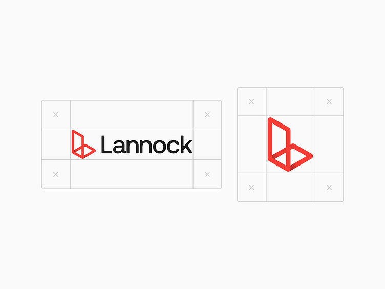
We completely redesigned the logo for Lannock from the ground up.
The idea behind the mark is to recreate the letter “L” for “Lannock” while resembling a building with its shadow or a door to feel welcoming.
Full Case Study on Behance 🤘 https://www.behance.net/gallery/196034489/Lannock