Taxi Service Business Logo Design Concept

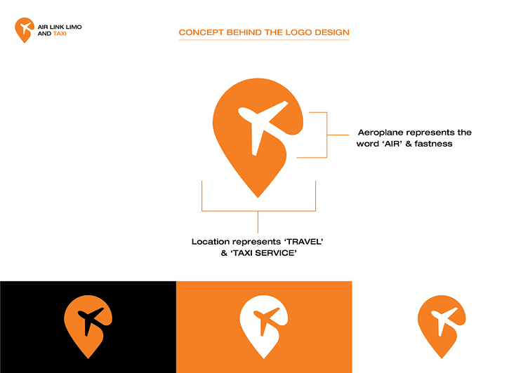
The design concept behind the logo for Air Link Limo and Taxi creatively blends elements that symbolize both the nature of the business and the brand identity. Here’s the breakdown:
Aeroplane Icon: Positioned centrally within the logo, the airplane symbol represents the word 'Air' from the company name, reflecting the business's connection to air travel and airport services. Moreover, the icon suggests speed and efficiency, emphasizing the swift and reliable service that the company aims to provide.
Location Pin: The overall shape of the logo is a location pin, which is universally recognized as a symbol for places and navigation. This shape conveys the company’s role in travel and location-based services, specifically highlighting their taxi and transportation offerings.
Color Scheme: The use of a bright orange color likely serves several purposes. It stands out visually, ensuring the logo is noticeable and memorable. Orange can also convey energy and enthusiasm, aligning with the company's dynamic approach to customer service.
This logo efficiently communicates the essence of Air Link Limo and Taxi, suggesting that it is a modern and reliable choice for travelers seeking fast and convenient transport services, particularly to and from airports.