Georgia Fiduciary Group Website UX/UI Design & Graphic Design
Roles
UX/UI Designer, Graphic Designer
Tools
Adobe XD, Adobe InDesign, Adobe Illustrator, Adobe Photoshop
Introduction
The nature of the Georgia Fiduciary Group's practice always goes back to managing people’s money, which they know can be very touchy and intimidating. Their team brings abundant knowledge in the probate, trust, and conservatorship areas of practice. They understand the difficult challenges that can accompany a life change, and are seeking to guide clients through their specific and unique circumstances. The GFG team believes in lasting relationships with their clients, making every step of the process personal, rather than transactional.
My goal in developing a website interface for GFG was to deliver a trustworthy atmosphere that comes across as welcoming. However, because they are a practicing law firm, I wanted to maintain a level of professionalism which I achieved through the use of minimal, cool toned color palette and basic shapes. The client wanted to lead with blue tones, but asked to incorporate a tan accent, which I mainly executed through hover animations and icons so as to not disrupt the overall palette flow. I chose to repeat the imagery in their logo to provide cohesion throughout the website while giving the page some visual movement to balance the otherwise simple layout.
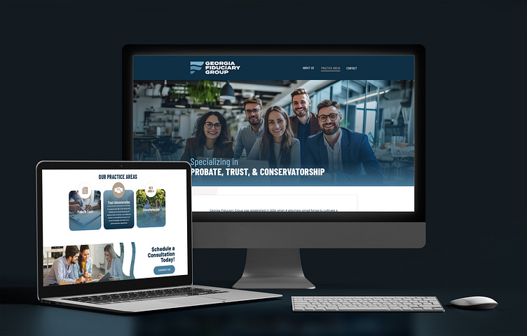
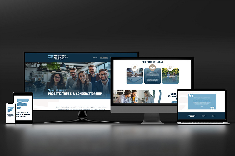
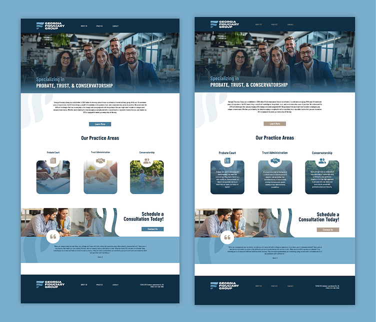
Below: mockups of the final landing page
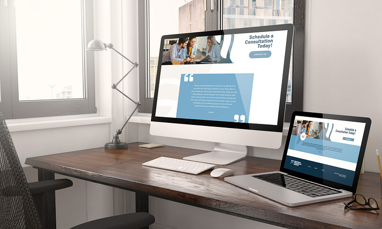
Below: mockups of two versions of the CTA and client quote
Proposal
Challenge
How might I create a website that allows the Georgia Fiduciary Group to translate their mission and services to clients with a welcoming and trustworthy personality?
Key Objective
The Georgia Fiduciary Group should deliver a wealth of knowledge in the probate, trust and conservatorship areas, making their clients feel safe and informed. Their website should effectively deliver explanations about their practice, and steer clients seamlessly towards contacting the GFG to start a working relationship. After interacting with the website, users should feel they have been seen and attended to, with clarity about following steps.
Solution
I designed a website that effectively delivered the friendly personality of the Georgia Fiduciary Group while maintaining professionalism. To do this, I used simple shapes and limited colors to minimize distractions and chose font styles that were easily legible. I incorporated imagery that supported the text, but made sure to keep all depictions lighthearted and warm. I wanted to prioritize maintaining a straightforward layout to juxtapose the intimidating nature of law practices, hoping to give users a sense of control as they navigate the website.
Design Analysis
User Pains
Missing a resource to inform clients about their services
Clients often get intimidated and confused around this subject matter
Their firm has not yet been legitimized and they need to clean up their current resources to regain legitimacy
Don't have a place where potential clients can both become informed and contact them
Law firms are often perceived as cold, distant and complicated
User Desires
A site that is informative and prepares clients on what to expect
Not necessarily needing to drive traffic, mainly a website that establishes who they are and legitimize their firm
A resource for other attorneys who are recommending their services and families who are in need of their service
To establish that they are a relational practice rather than strictly business oriented
User Persona
Not the typical stuffy law firm, they are more casual and involved in people's daily lives
They are welcoming, genuinely fun and hilarious people
Enjoy relationships and friendships over their work, but still prioritize getting their work done
Don't wear suits and ties, prefer a more casual practice environment
Execution
A site that leads with their specialties of probate, trust and conservatorships
Delivers their mission and the heart behind their work, along with a little background expanding upon who they are
Categories that elaborate on their specialties
CTAs that encourage uses to contact them
Client quotes to further establish trust and friendliness
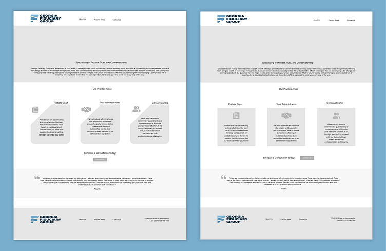
I began by developing some wireframes for the website to get a feel for how much space their text and other requirements would need. I liked the idea of a full width hero image of a team photo to establish the GFG as personable individuals rather than stuffy lawyers. I then chose to insert their categories of practice beneath their description for ease of access. My vision was to use hover cards for this area- where the user could hover over a category and watch an explanation appear over a transparency. On one version (left), I implemented a modified shape and asymmetrical headers, while on the other (right), I played with a more traditional route. I finished the page with a supporting quote to wrap the site on an optimistic, supportive note.
Below: two versions of wireframes for the GFG website
After my wireframes were approved, the client and I landed the more traditional category style for their specialties. I also moved the bulk of their informative text beneath the hero image to give the header room to shine. Both the hero and category images needed a transparency to improve text readability, and rather than using black I chose to go with the navy blue in their palette for cohesion. The CTA was getting lost in the other elements of the page, a problem I remedied by turning it into a graphic. I used an inverted version of the imagery in the GFG logo to fade the graphic into the CTA text. Finally, I highlighted the client quote to ground it against the white background.
Below: high fidelity wireframe of the GFG website (right), hovered elements of the GFG website displayed (left)
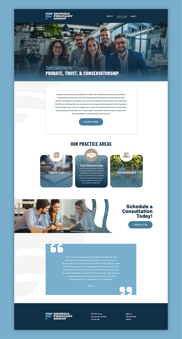
In this final version of the website, the margins of the page were increased, providing breathability. The body text and quote were both pulled off the page using shadows, and the CTA buttons were rounded to soften the overall look of the page. The logo imagery I pulled into the background read better horizontally, however I chose to leave it vertically oriented in the CTA graphic due to the visual success of its use. The client wanted to see a little more of the gold accent outside of the already established hover animations, so I incorporated it into the icons and background imagery, as well as using it for the hover animation in the menu. Some font modifications were also made to distinguish hierarchy, but overall the main usage of text remained unchanged.
Below: final high fidelity wireframe for the Georgia Fiduciary Website
Ultimately, this project was an extremely informative venture into an industry that is more professional than who I normally design for. It was a good exercise in using minimalist design tactics to achieve a visually interesting but clean look. The most challenging component of this project was actually finding imagery that fit the narrative the client was looking for, as they didn't supply their own photos. I really appreciated being able to work with the client through the entire process, and speaking with them before transitioning to the next stage gave me a lot of clarity on how to proceed. If I had to return to this project, I would like to try building out a mobile version that captures the same personality.
