Performance Marketing Agency - Website concept
Enter your text here...Hi everyone!
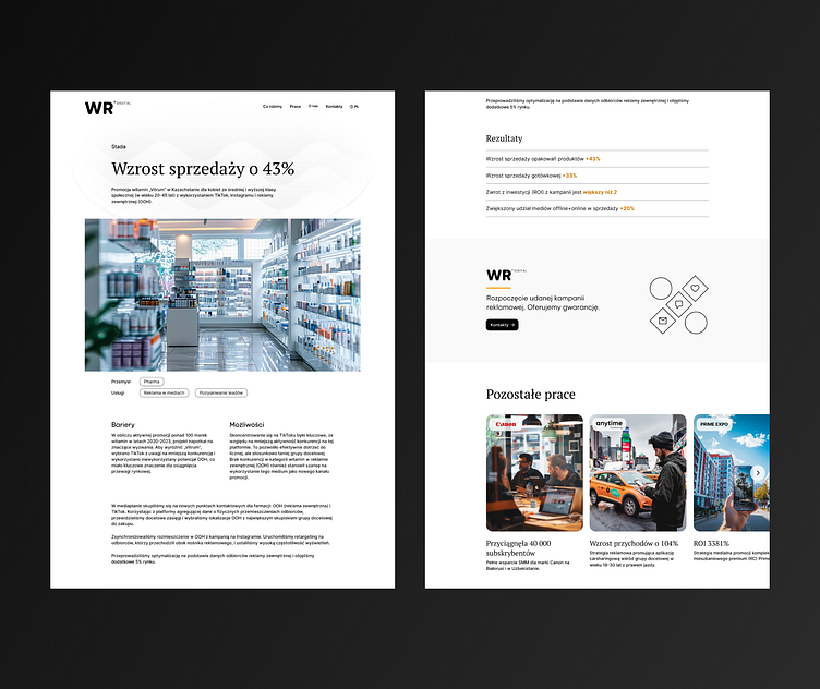
This is a case study page for an agency specializing in performance marketing. The page is divided into several logical blocks.
The top part contains the case study title and a brief description. In the header, I have highlighted the key achievement within the case study to immediately state the company's achievements in its activities. The brief text under the header should give a general overview of the case study - area, type of campaign, features. I use the first screen to maximize the features of the case study that best represent the company.
The illustration block serves as a visual separator between the top and the main description.
The main case description contains text blocks. In the case structure, there are Barriers and Opportunities blocks that reflect the main challenges facing the company in this work. On the large screens, these texts are arranged next to each other in a two-column grid to emphasize their relationship. The other blocks are arranged without columns to avoid mixing their meaning with other texts.
The results block is represented by a simple text block where each line contains one measurable achievement. The number of achievements in this block is limited to, for example, five values. Although performance campaigns can display a lot of statistics showing the success of the campaign, it is better to highlight five key indicators so that the site visitor is not confused by the multitude of numbers.
The bottom of the page ends with a block to go to the contact page and a block with other similar cases.
