Isla Marketing Logo and Branding

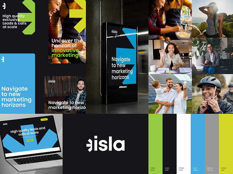
Rebranding project for Isla Marketing, a full service marketing firm focusing on finance, insurance and legal. We've worked on refreshing their logo as well as their brand identity from the original logo we created back in 2020. They wanted the new brand to feel more colorful, bold, with clear indications of what they do and offer.
Isla's logo is a harmonious blend of a symbolic mark and the letters forming "isla." The mark ingeniously combines elements of a sunrise and an arrow, with the arrow's shape cleverly cut to also suggest the horizon. This design choice not only embodies the idea of new beginnings and forward momentum but also integrates the mark and the word "isla" seamlessly, creating a unified and distinctive visual identity.