Knowledge Cloud Website Redesign Concept

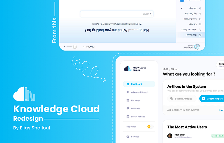
From complex and boring experience into simple, clean and modern one ✌🏻
This is my simple redesign concept for Knowledge Cloud website which in my opinion, have laking in simple and clean user interface to guide the users throw their journey with this website.
Site Analysis
I saw that the main idea in this system is to create a multi-user idea sharing database which will consider the company profile like a normal user and have its articles, users (admins are considered shared users between companies but have their own articles in each company),
so if I make a company called Test and another called Test2 with admin user called Elias, each company will have it stand alone departments, catalogs and articles.the catalog must be visible for one or more department in the company so if your article belong to Cat1 category and this category visible only to IT department, so if your user isn’t have this department it won’t be visible in the data of this user and company,
and each article must have a manager (which is a normal user in current company) and a publish date and one or more catalog category,
and starting with the previous analysis, I started to redesign this website with considering the most important pages to redesign:
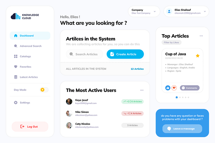
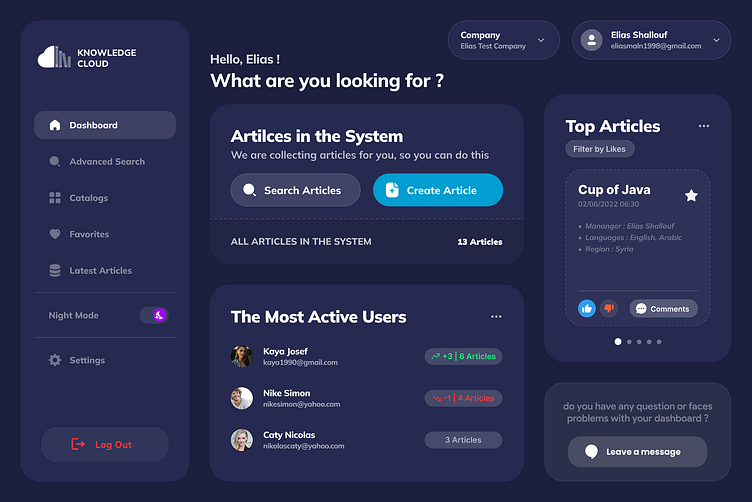
Dashboard (which already I have attached its concept).
Adding new article page: Each article must have a manager (which is a normal user in current company) and a publish date and one or more catalog category, so what was hard to understand for me in the first time publishing article (Cup of Java) was the manager field itself !!, and I recommend to add more information to this fields like show all current users (not type 3 chars to filter !!!) and a action button will redirect you to insert a new user to show it as manager, co-author and partner.I see that page should be 3 parts, the left side or navigation and the main section or center one will have a card to type your article content and the 3rd part is the right side which will have the attachments section and the other information about article like manager, region ...the save buttons could be at right-top part instead of user and company cards.
Landing Page Redesign: This page must be the most attractive one in the system, because it will give the guests a big impression about the system idea and the more the design is good and have a nice short explanation sections, the more of the user fall more comfortable to the system.
If your website seems old and boring ... don't hesitate and just give me calling 😉
I'm ready to level up your website's and app's UI/UX to a higher user-centred design.
Feel free to chat me anytime at [email protected]