Minimal Dropdown Interaction
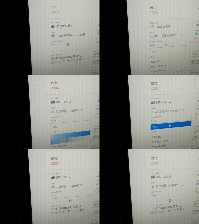
A minimal interaction I worked on a a year ago. It triggers a dropdown on click and hides itself when a value is chosen.
I chose such an interaction to avoid ugly boxes and lines where you have a view where everything is editable (either via a dropdown, or text box).
The user would be given a tour / coach marks / welcome screen on first login highlighting that all fields visible are editable.
Regret the shaky video but that's the only view I have left to it.
More by Aliakbar Attarwala View profile
Like

