Inergy Infra - Renewable Energy Technologies Company Branding
Inergy Infra - Renewable Energy Technologies Company Branding 🤩
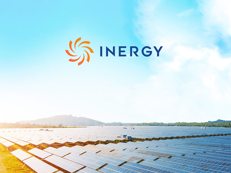
Introducing the bold new brand identity for Inergy Infra – pioneers in Renewable Energy Technologies. Ideamagix is thrilled to present our collaboration in reshaping the landscape of energy infrastructure development logo and branding.
We crafted a comprehensive experience on this project that covered our journey with Inergy Infra encompassed:
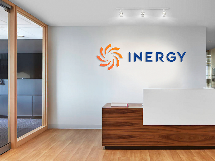
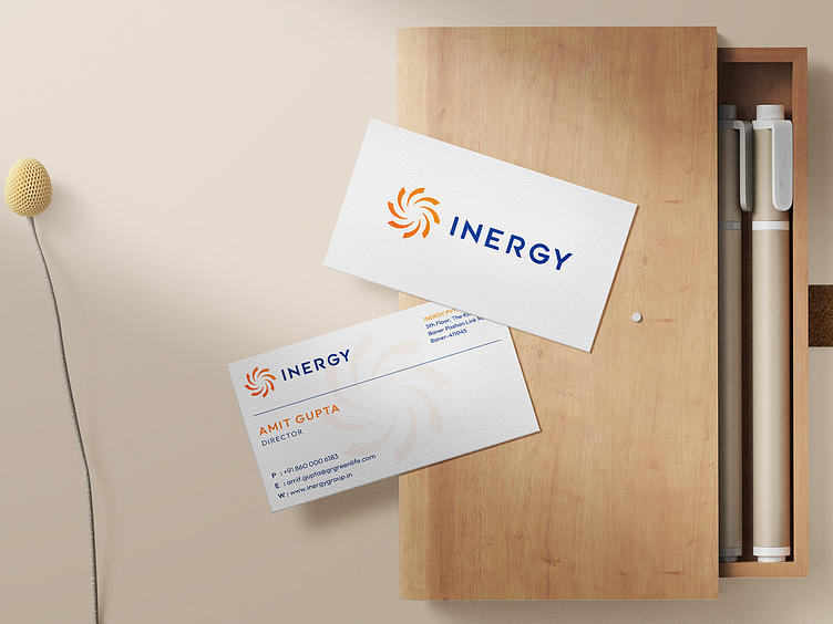
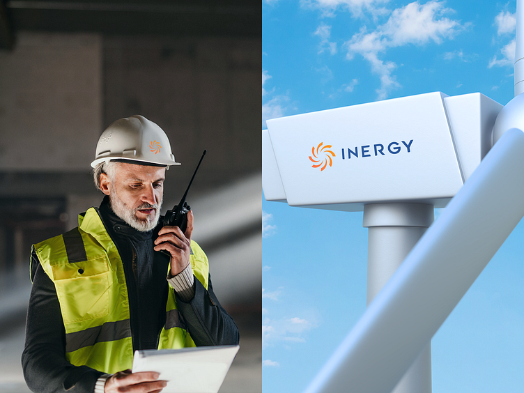
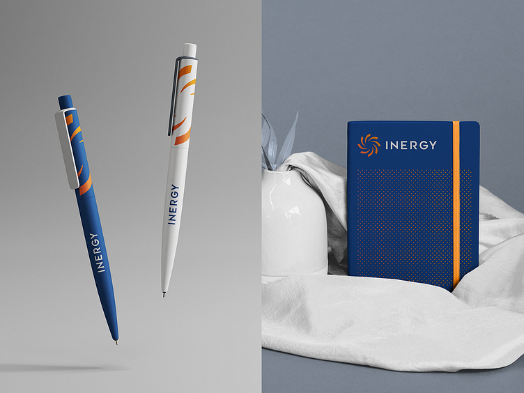
Complete brand identity (logo, colors, brand guidelines, marketing materials)
Promotional landing page
The platform's UX/UI design
Stay tuned as we delve into the intricate details of the logo and brand identity. Let's redefine the future of renewable energy branding together.👇
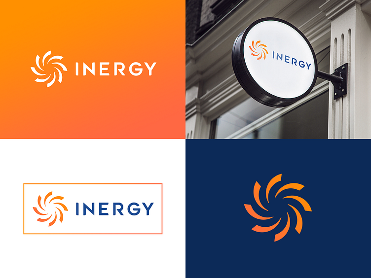
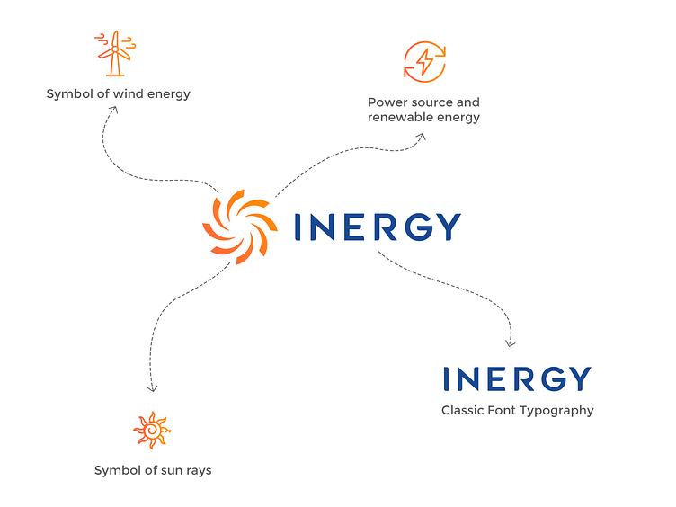
Empowering Energy: The Logo's Symbolism of Sun and Wind Energy
The Inergy Infra logo embodies its mission with striking symbolism. Its circular design evokes the sun, representing the core energy source, essential for any renewable energy endeavor.
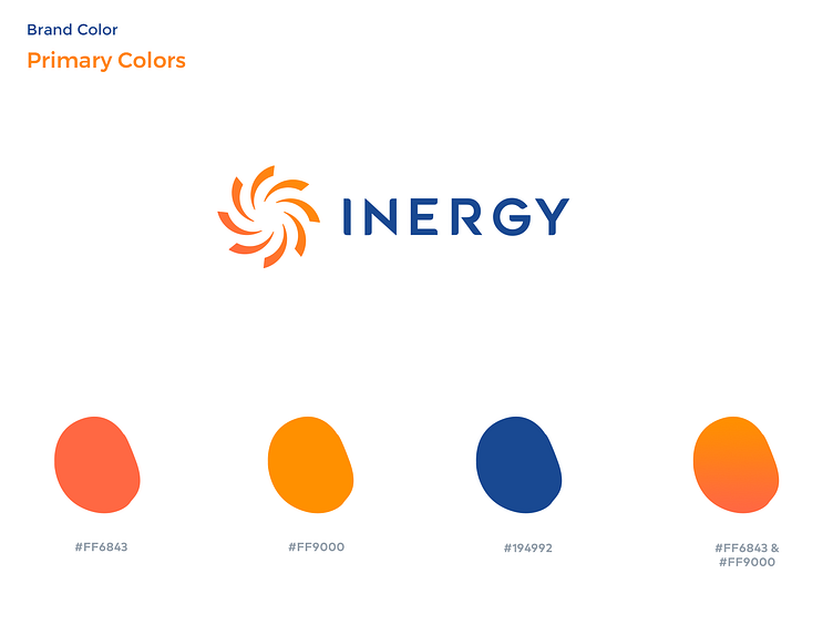
Elevating Trust and Growth: The Power of Our Color Palette
At Ideamagix Design Studio, we carefully curated a dynamic color palette to enhance the essence of Inergy Infra's brand identity.
We'd love to hear your thoughts on our work!
If you're satisfied with the results, feel free to express your appreciation by tapping the "L" or love button. Your feedback fuels our motivation to deliver excellence.

************ Don't forget to add ❤️ and Follow us ***************
We are open to new projects! Contact us | Instagram | [email protected]
