Dashboard Design

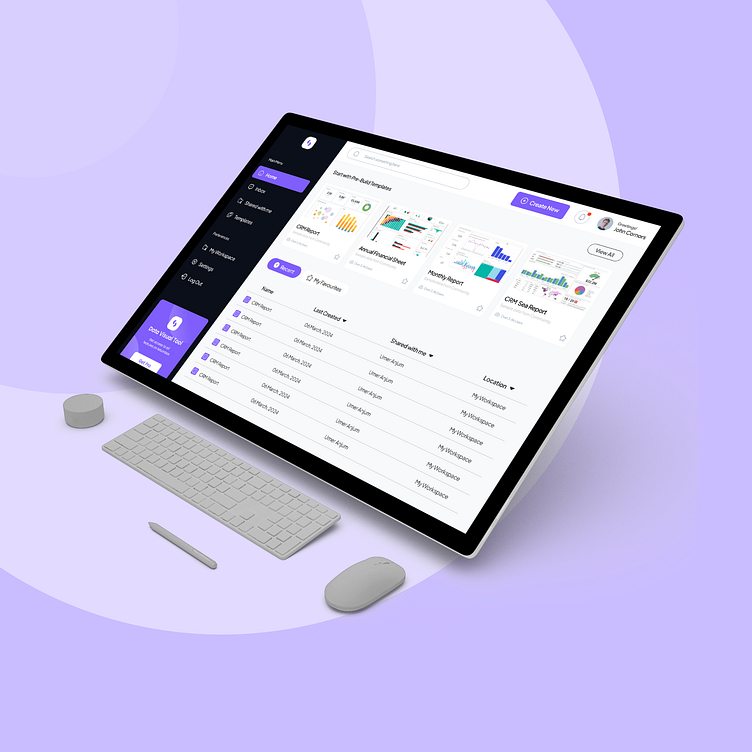
Overview: As a UI/UX designer, I was tasked with creating a user-friendly data analysis dashboard for a client in the financial sector. The objective was to provide stakeholders with a comprehensive platform to visualize and interpret complex financial data efficiently.
Challenge: The main challenge was to design a dashboard that catered to the diverse needs of stakeholders, ranging from analysts to executives, while ensuring ease of use and clarity in data presentation. Additionally, the dashboard needed to accommodate various data sources and types, including numerical, textual, and graphical data.
Approach:
User Research: Conducted interviews and surveys with stakeholders to understand their requirements, pain points, and preferred data visualization techniques.
Information Architecture: Developed a hierarchical structure for organizing different data categories and created a navigation system that allowed users to easily access relevant information.
Wireframing and Prototyping: Created low-fidelity wireframes to outline the layout and functionality of the dashboard. Iterated on the designs based on feedback before moving to high-fidelity prototypes using tools like Sketch or Figma.
Visual Design: Employed a clean and minimalist design aesthetic to prioritize data clarity and readability. Utilized color coding and visual cues to highlight key insights and trends within the data.
Interactive Elements: Incorporated interactive features such as filters, drill-down capabilities, and hover-over tooltips to enable users to explore and interact with the data dynamically.
Accessibility and Responsiveness: Ensured that the dashboard was accessible to users with diverse abilities and devices by following best practices for accessibility and designing a responsive layout that adapts seamlessly to different screen sizes.
Outcome: The resulting data analysis dashboard provided the client with a powerful tool for gaining actionable insights from their financial data. Key features and outcomes include:
Streamlined access to critical financial metrics and KPIs.
Enhanced decision-making capabilities through interactive data visualization.
Improved efficiency in data analysis workflows, leading to time and cost savings.
Positive feedback from stakeholders on the intuitive design and user-friendly interface.
Conclusion: Designing an effective data analysis dashboard required a thorough understanding of user needs, thoughtful information architecture, and attention to detail in visual and interactive design elements. By leveraging these principles, we created a dashboard that not only met the client's requirements but also exceeded their expectations in delivering actionable insights and facilitating data-driven decision-making.