Nissan Advertising Graphic Design
Roles
Graphic Designer
Tools
Adobe InDesign
Introduction
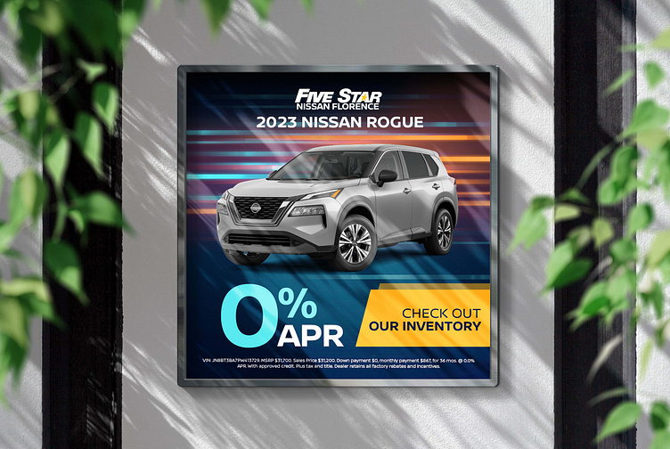
This is an advertisement chain for Five Star Nissan Florence selling the 2023 Nissan Rogue, Armada and Titan. As a social add, these banners will be elements on social media, most likely displayed on a mobile app.
Design Process
User Needs
Mobile app dimensions
Still imagery of vehicles of the correct year and trim level
Prominent establishment of discounts
Must have disclaimer
Must have Five Star Nissan Florence Logo
Must have prominent display of vehicle year, name and trim level
Execution
1080x1080px dimensions for mobile visualisation
High contrast color palette for visibility of discounts and offers
Isolated vehicle imagery displayed centrally and below the year, vehicle name and trim level
Incorporation of the Five Star Nissan Florence Logo
Incorporation fo the disclaimer
Abstract background that is visually stimulating but not distracting
When creating these ads, the most important elements are the discounts and offers. In order to make them stand out, I chose to use high contrast and visibility colors, pulling them from the background so that the overall look of the advertisement would be consistent. I chose to place the Five Star Nissan Florence logo and vehicle name at the top of the ad so that the reader would know the dealership and type of car they were looking at before confronting the discounts and offers.
When picking a background, I wanted one that had color and movement, but lacked significant detail so as to not distract from the vehicle imagery I placed in front of it. I then set the disclaimer at the very bottom to not distract from the rest of the advertisement.
Below: Each of the advertisements in the Five Star Nissan Florence advertisement
Creating car ads has taught me a lot about the hierarchy of information. As I am inclined to make ads visually appealing with graphic elements, car advertising has challenged me to think critically about what the most necessary information is and where it needs to appear. I like the challenge of developing new ways to aesthetically deliver very routine information without disrupting this hierarchy, and appreciate honing the skill of fitting large amounts of text into small but interpretable dimensions. When I do these assignments, I often enjoy cycling them through different dimensions to practice rearranging the content while maintaining the priority of information.


