Volkswage Advertising Graphic Design
Role
Graphic Designer
Tools
Adobe Illustrator, Adobe InDesign
Introduction
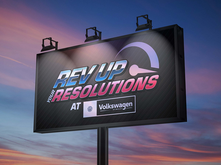
This is advertising I designed for a sales event for Volkswagen. Automotive dealerships cycle through multiple sales events per season and require advertising that can be easily replicated throughout the event as offers and discounts change. A priority in automotive ad design is high contrast, bold logos that are eye-catching and easy to interpret." Rev up Your Resolutions" was a sales campaign taking place at the beginning of 2024, when customers were developing their New Year's resolutions.
The first design I developed for this campaign was based on the concept of revving an engine. I chose to incorporate a simple depiction of a speedometer alongside the text, prominent but not overbearing. For the text itself I used Adobe Illustrator to create a bold, italicized font with a gradients from the Volkswagen color palette. Splitting the colors into blues and pinks for the different lines of text allowed for some differentiation between the words and promoted readability.
Below: The first version of the Rev Up Your Resolutions campaign logo
The second version I designed was based on the concept of starting a race, or starting the new year. The font I chose to use was more angular, and underlined by a half arrow that evoked speed. For this design, I made "Rev Up" the focus by enlarging it above "Your Resolutions" so that the eye would travel there first. Behind the design I placed a checked flag to further reinforce the idea of a race and contextualize the logo.
Below: The second version of the Rev Up Your Resolutions campaign logo
The dealership ultimately landed on the first design that incorporated the Volkswagen colors and speedometer. I enjoyed the challenge of incorporating the speedometer into the text and exploring what arrangement of colors ideally suited the overall design. Both logos were clean and effective, however if I had to make any changes I would re-design the second logo to stand on it's own without having to depend on the background imagery so much. I would do this by incorporating the checkered flag pattern into the text itself, or perhaps involve an actual graphic of a checked racing flag.


