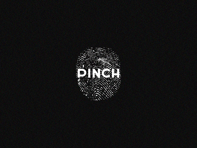
Pinch restaurant | Branding | Logo
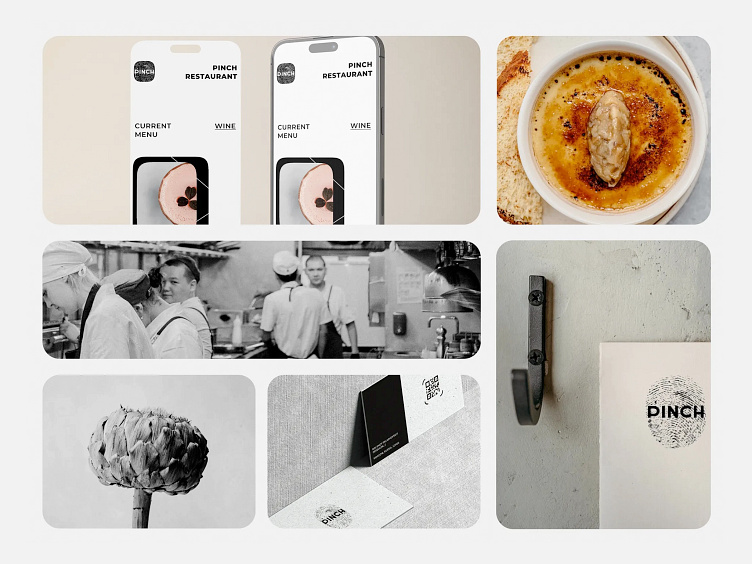
Pinch restaurant | Description
The "PINCH" logo captures the essence of individuality with its bold fingerprint design, symbolizing the unique human touch brought to every culinary creation. The stark white lettering on a dark background creates a dramatic contrast, emphasizing the brand's focus on the personal, bespoke experience of flavor. This logo cleverly plays on the dual meaning of 'pinch'—a small amount of spice and a tactile action—fusing identity and experience in a visual narrative that promises a truly handcrafted gastronomic journey.