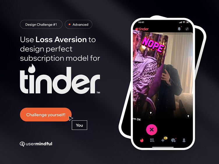
Use Loss Aversion to design perfect subscription model
Users hate to lose. Imagine you're on Tinder and you make a wrong decision, accidentally swiping left and potentially missing out on the love you aspire to. Tinder understands well that people are more sensitive to loss (2.5x more) than attracted to similar gains. This psychological effect is called loss aversion.
Swiping left (which is a no) on a potential match can trigger a thought of "what if that was a perfect person?" Tinder understands that FOMO (fear of missing out) is a powerful force in online dating. That's why they offer the premium "Rewind" feature, letting users backtrack for a price.
You can now become a behavioral specialist and boost your design skills!
______
Challenge: Imagine that as a designer, you need to solve the business problem of low sales of premium subscriptions on Tinder. However, you know that people often want to regain what they've lost, especially in such a sensitive topic as finding a partner.
Task: Outline the idea or design a screen, mechanic, or prompt that, using their sense of loss, would encourage them to purchase a premium subscription.
Here you will find some hints how to achieve it:
Reframe the Message: Highlight what users stand to lose if they don't take action, like missing out on potential matches or love interests.
Emphasize Limited Opportunities: Use phrases like "limited time offer to restore the swipe" or "exclusive access" to create a sense of urgency and scarcity.
Use Contrast: Show the contrast between what users should do (swipe right) and what they have lost (miss out on a potential match).
Frame Gains as Losses for Inaction: Present swiping right as gaining an opportunity for a match, while swiping left means losing that chance.
Set Deadlines: Introduce time limits for subscription to pressure users to act quickly to avoid missing out.
Price Point Comparison: Show the difference between the benefits of a premium subscription (e.g. only 5$ for to get back potential partner) and the potential loss of missed opportunities with a free account.
Be Implicit: Use subtle cues rather than explicit prompts to avoid coming across as manipulative to users.
Refer to user values: Identify what matters most to users, such as finding love or connecting with others, to tailor the redesign to their preferences.
Be sure to share your proposals in the comments!
_________
See how this behavioral principle is used to impact your perception and motivation in UX:
Other Principles:
__________
Behavior Design:
__________
Disclaimer:
*This material is created for educational and analytical purposes only. UserMindful is not affiliated with, endorsed by, or sponsored by Tinder or its parent company. All logos and trademarks used in this material belong to their respective owners and are included here under fair use for educational purposes. This work is independent and has not been authorized, sponsored, or otherwise approved by Tinder.

