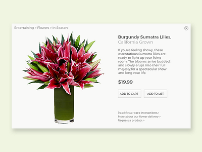
DailyUI #012 - ecommerce product
For today's DailyUI exercise, I reimagined a FreshDirect product page in a cleaner "product card" style.
I think one of the big problems the designers there deal with is page bloat. Product pages really end up being design by committee, which throws in everything... all with equal weighting, of course.
Anyway, I've included a lot of the content, but what I excluded were the product recommendations, the social buttons and the sale pricing display, which is really complicated and ugly.
More by Leitha View profile
Like
