mercedes-benz cockpit menu concept
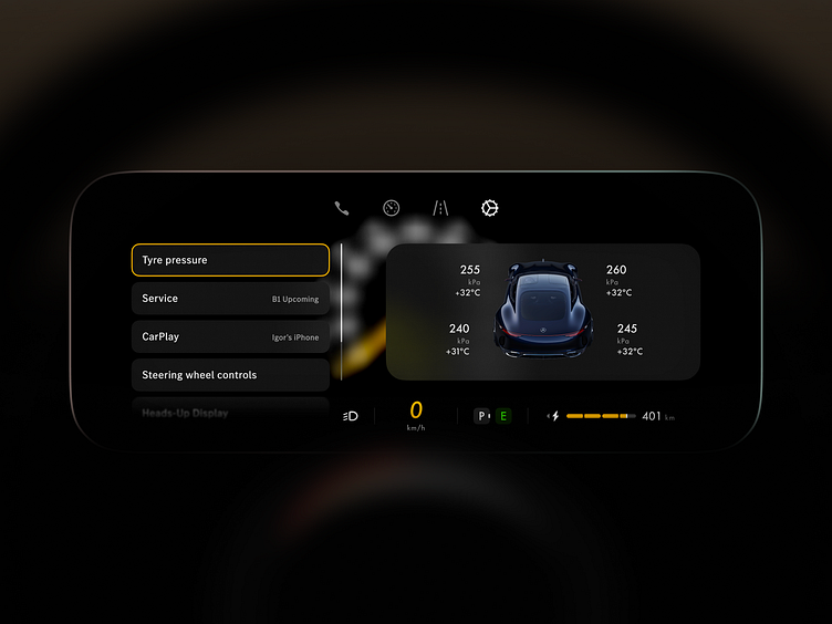
As a Mercedes owner and product designer, I couldn’t resist reimagining the MBUX dashboard menu because it felt clunky to switch between categories on the go.
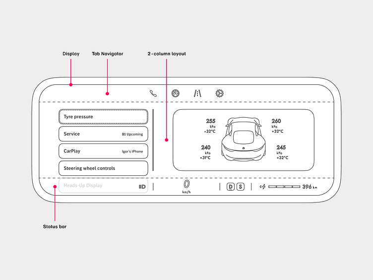
This is my take on a PlayStation-style UX: category tabs at the top, rich visual info below. Everything updates instantly with user input. No more move, move, move — select — move — select — view.
A better solution might be an even more visually-rich grid layout, but that’s a concept for another Dribbble shot…
Fonts used
- Futura Now
- MB Corpo S
Tools used
- Figma
- Midjourney
Thanks for watching 🙏
Make sure to hit Like and comment on this shot!
