Pharmacynet e-commerce Redesign

What is Pharmacynet?
Pharmacynet is a South African e-pharmacy platform that allows users to shop online, make enquiries with pharmacists and have their medication delivered to their doorsteps in and around Bloemfontein.
The target market for Pharmacynet is the general public, some clinics as well as medical professionals. The e-commerce website is tailored towards personal use by people wanting to purchase medical supplies. The company’s competitors include but are not limited to the following companies; ePharmacy, Net Pharmacy, Clicks, Dischem.
The purpose of this project?
The purpose of this project is to improve the User Experience to encourage customers to complete their desired actions which, in this case is shopping. The redesign is not only cosmetic but it also challenges usability and overall experience so as to better communicate Pharmacynet as a business, its value proposition, and to potentially align the website performance to marketing goals.
Problem:
While there are some good things about the pharmacy net website that make it simple and easy to use, it is important to also note what could potentially be improved so as to enhance the site’s current functionality and reach even more customers.
Some of the things that need to be improved include the following
Design needs to be updated to current standards
Information Architecture
Mobile responsiveness
Update content
I will go into detail below to unpack these further.
Design needs to be updated to current standards:
Updating the look and feel of the website will not only improve interactions with customers but it also sends out a message that you are currently in business. When a website looks dated, it poses a risk of a high bounce rate and users will become skeptical to buy from the site or even signing up for future purchases. Little cosmetic updates to the website can be inviting and can make users more curious about what you have to offer.
Information Architecture:
What Information Architecture is, is simply a way of structuring and organizing the structure and content of a website so as to communicate the key message effectively. With a well-crafted information architecture, you’re able to convey key information to users in a matter of seconds, increasing conversion rates and sales while a poorly crafted information architecture can send a mixed message, leading to a high bounce rate.
Mobile responsive:
Regardless of the target market, a lot of people use their phones more than they use their laptops. Mobile phones offer speed and convenience in that, you can do your shopping from anywhere at any time. This is very important for an e-Pharmacy because when the website is not mobile-friendly you will most likely miss a sale and again send a message that you’re out of business. Additionally, websites that are not optimized for mobile phones can be downgraded in search engines.
Outdated content:
Not updating the website can have a negative impact on the business’s online presence and general engagement of the user with that the business has to offer. While some businesses do well operating outside of the net, it is important to always maintain an online presence to reach customers that are further away. Part of doing this is ensuring that the company publishes relevant content across social media, website and online blogs.
Solution:
The solution that could possibly remedy the above-mentioned is to review the entire website and its accompanying strategy, revisiting the look and feel of the website and planning out the content and information architecture. This will not only assist in re-establishing the brand in the e-pharmacy market but will also help it reach other markets, improve customer interactions and convey the brand’s unique value.
Using the following steps I would be able to achieve the desired outcome:
Visual Audit of the current website to find design inconsistencies (see visual audit report here)
Heuristics evaluation of the current website to identify the usability problem
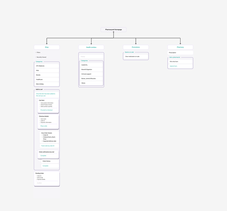
Site map and design rationale
Visual direction
Redesign
Case Study
I'll be sharing the rest of the work in a few posts but share your thoughts in the comments!

Problem:
While there are some good things about the pharmacy net website that make it simple and easy to use, it is important to also note what could potentially be improved so as to enhance the site’s current functionality and reach even more customers.
Some of the things that need to be improved include the following
Design needs to be updated to current standards
Information Architecture
Mobile responsiveness
Update content
Design needs to be updated to current standards:
Updating the look and feel of the website will not only improve interactions with customers but it also sends out a message that you are currently in business. When a website looks dated, it poses a risk of a high bounce rate and users will become skeptical to buy from the site or even signing up for future purchases. Little cosmetic updates to the website can be inviting and can make users more curious about what you have to offer.
Information Architecture:
What Information Architecture is, is simply a way of structuring and organizing the structure and content of a website so as to communicate the key message effectively. With a well-crafted information architecture, you’re able to convey key information to users in a matter of seconds, increasing conversion rates and sales while a poorly crafted information architecture can send a mixed message, leading to a high bounce rate.
Mobile responsive:
Regardless of the target market, a lot of people use their phones more than they use their laptops. Mobile phones offer speed and convenience in that, you can do your shopping from anywhere at any time. This is very important for an e-Pharmacy because when the website is not mobile-friendly you will most likely miss a sale and again send a message that you’re out of business. Additionally, websites that are not optimized for mobile phones can be downgraded in search engines.
Outdated content:
Not updating the website can have a negative impact on the business’s online presence and general engagement of the user with that the business has to offer. While some businesses do well operating outside of the net, it is important to always maintain an online presence to reach customers that are further away. Part of doing this is ensuring that the company publishes relevant content across social media, website and online blogs.
Solution:
The solution that could possibly remedy the above-mentioned is to review the entire website and its accompanying strategy, revisiting the look and feel of the website and planning out the content and information architecture. This will not only assist in re-establishing the brand in the e-pharmacy market but will also help it reach other markets, improve customer interactions and convey the brand’s unique value.
Using the following steps I would be able to achieve the desired outcome:
Visual Audit of the current website to find design inconsistencies (see visual audit report here)
Heuristics evaluation of the current website to identify the usability problem
Site map and design rationale
Visual direction
Redesign
Case Study
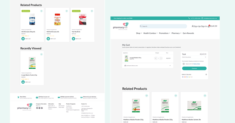
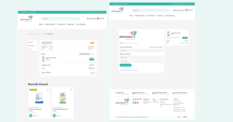
Design Process
The following steps were taken in the design and implementation of the Pharmacynet redesign project:
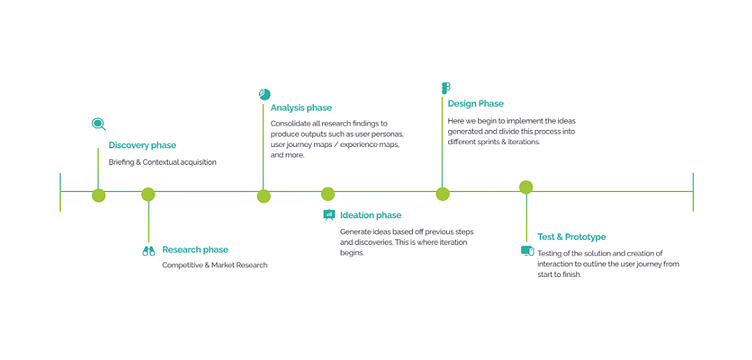
Implementation:
Understanding the brand: After doing a research into pharmacynet to try and gauge what the business is all about I saw that it is an affordable healthcare pharmacy that sells and delivers medicine affordably in some South African regions. The main focus is on offering the pharmacy experience both online and offline to serve the target market.
Research was done into the market where I found that the pharmacy market segment is currently big and has been since the beginning of the Covid 19 pandemic. The market has and will continue to expand although competition is robust with both large and small outlets each offering over the counter medicine whilst making the experience of connecting to a pharmacist accessible to everyone.
Analysis phase: During the analysis phase I was able to draw conclusions about what the e-commerce site needed and what the problem was, as well as who the solution was for. The key takeaways that stood out for me which required improvement was the landing page experience as well as the site needing to be modernized or improved to fit current design standards according to usability.
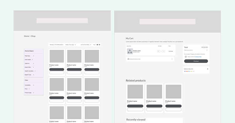
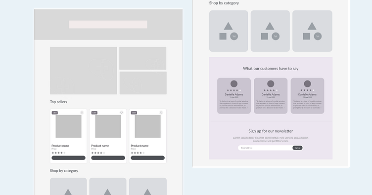
Low fidelity designs
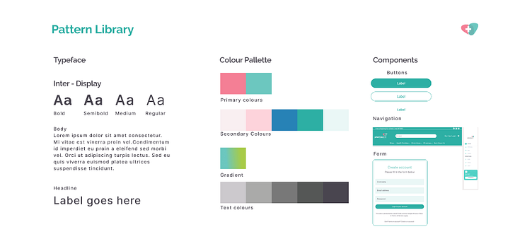
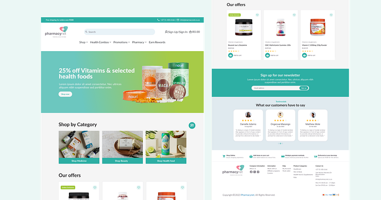
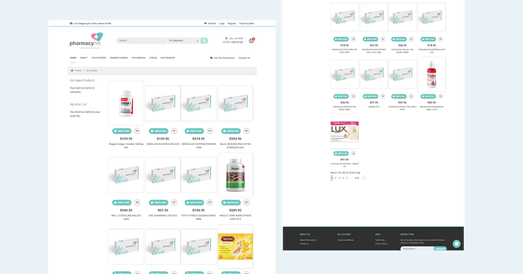
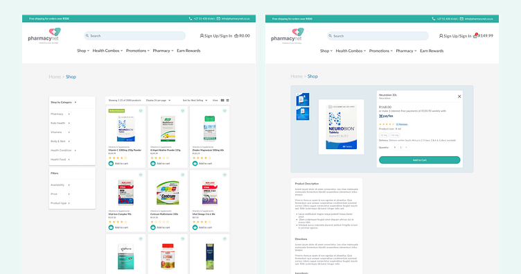
Final Designs (2nd Iteration)
Next steps:
The next and final steps of the project is testing. For this phase I will be sending out surveys with a questionnaire to a select group of users to validate the designs.
Let me know what you think in the comments.
To collaborate on a project please send an email at [email protected]