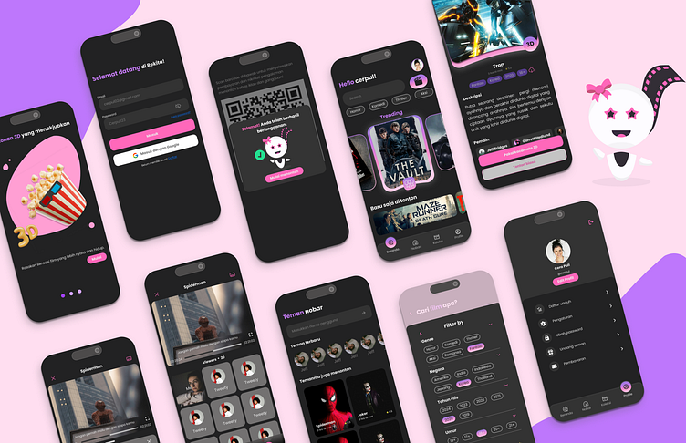
REKITA - Watching Mobile App
Introduction 👋
Rekita is a movie-watching application that provides a variety of very useful features. In Rekita, users can enjoy movies with friends and family through the watch together feature, equipped with various interactions such as video calls, voice, and chat. In addition, Rekita also offers a variety of 3D movie options that are rarely found in other applications. These 3D films can be enjoyed by users using 3D glasses. However, there is also an option to watch without 3D glasses, which will display the film in regular quality.
why REKITA? 🧐
Problems 🙇♀️
We chose Rekita because we identified an issue where people want to watch movies together with their loved ones, but there isn't a platform that provides simultaneous watch features with video call, voice, and chat to facilitate user interaction with their closest ones. Additionally, there are still few 3D movies available on other movie-watching applications or platforms besides in theaters. Therefore, we innovated to provide 3D watching features so that users can enjoy them easily and comfortably.
UX: Research & IA 🎯
To start this project, we are searching for user issues in several movie-watching applications.
Comparison of features between some simillar applications
Here some user's problem that we got :
The lack of subtitles makes users less understanding of what they are watching.
A bad UI can confuse users and lead to a frustrating experience when using the application.
Incomplete payment methods make users hesitant to subscribe.
Personalize it with a Persona! 🫂
After identifying the user problems, we decided to create personas that can represent those problems as well as possible. This would help us understand better what kind of users are most affected by these issues.
Journey Map 💭
To understand users' experiences and make them happier and more engaged, we crafted a detailed user journey map, pinpointing frustrations, potential improvements, and key interactions.
Explore the Solutions 🕵️♀️
Creating an application that offers simultaneous movie-watching with various interactions, a wide selection of films including 3D options, comprehensive payment methods at affordable prices, and designing a user-friendly UI to avoid confusing users.
Information Architecture
UserFlow 🚀
Developing a flowchart outlining user interactions that integrated our proposed solutions. This aided in crafting the sitemap and content structure for the app's design.
SiteMap 📝
Next, we crafted the sitemap to structure the app's concept information and pinpoint the necessary content for inclusion.
Prioritization Matrix 📌
To make informed decisions about which features and tasks to tackle first, we meticulously crafted a prioritization matrix. This tool helped me systematically evaluate and rank options based on pre-defined criteria, ensuring efficient resource allocation.
LoFi Wireframe 📝
Once the app concepts were finalized, we converted the flows and text into low-fidelity wireframes to provide an initial visual depiction of the Rekita's design.
UI : Design & Prototype 🌠
Design System 💌
Crafting a comprehensive design system to ensure consistency for Rekita's app.
Prototype ✍🏻
We are developing the high-fidelity design and prototyping it in Figma. To preview it, you can click here or try it out below.
Let me know what you think of the UI/UX Case I shared! You can email me at [email protected] or leave a comment right below ⬇️ ⬇️ ⬇️
Thank you! ☺️


