PirateCook
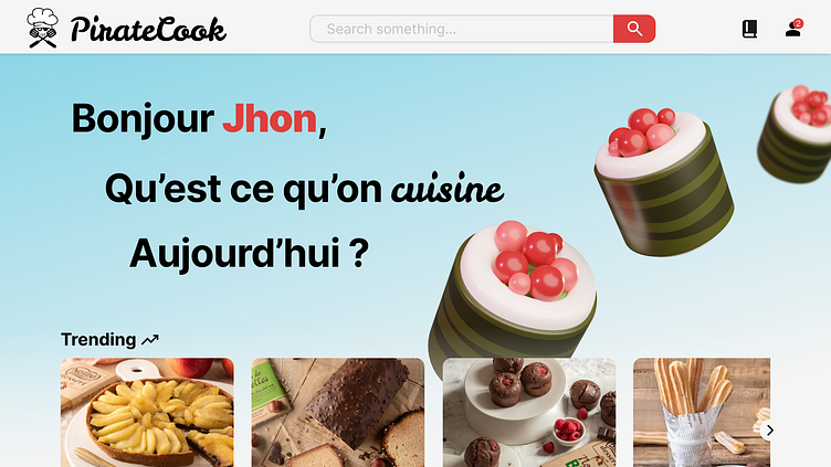
Once settled on the name 'PirateCook,' I started working on the logo design from which the entire visual branding would stem.
I knew I wanted to incorporate a chef's hat into the logo. While searching for inspiration, I came across a logo featuring a chef's hat with crossed spatulas.
Immediately, I saw the potential to create a logo resembling pirate flags, which perfectly complemented our chosen name.

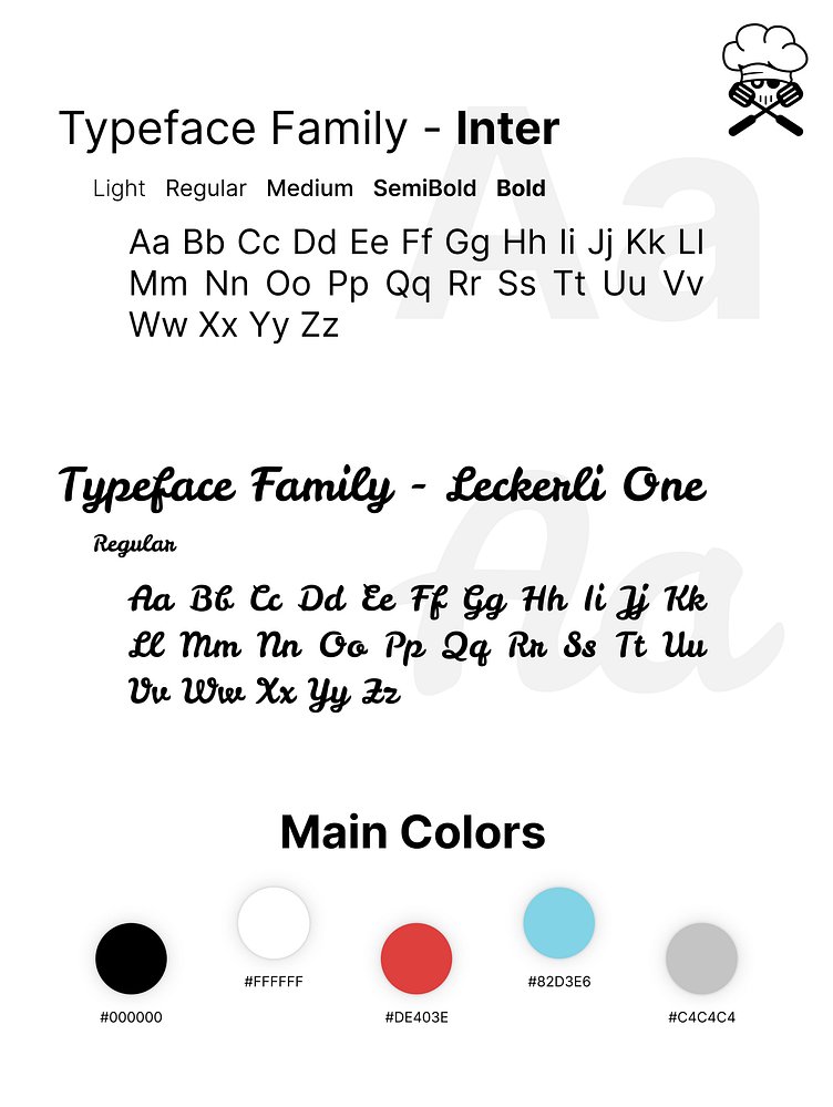
Next, it was time to choose the typefaces and color palette.
For the typefaces, I selected Inter as a simple, readable font for body text, while Leckerli One was chosen for the logo and headings. Leckerli One is less legible but adds a fun, whimsical touch to the website's branding.