PETCARE - Instagram Posts

Para este projeto pessoal, comecei com apenas um nome e alguns conceitos para criar uma identidade visual e algumas postagens em mídias sociais para uma marca fictícia.
For this personal project, I started off with only a name and a few concepts to create a visual identity and a few social media posts for a fictional brand.
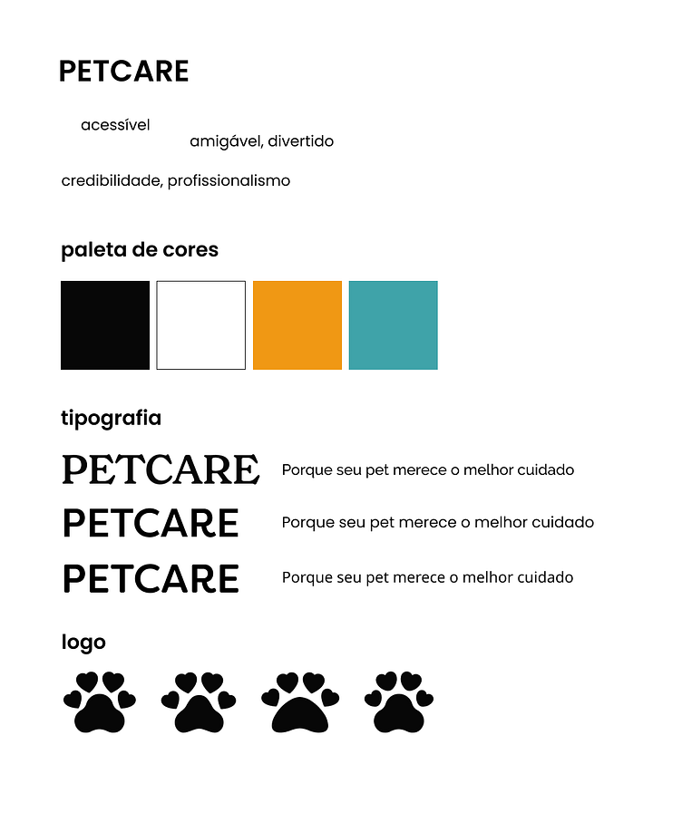
Para a paleta de cores, eu escolhi o laranja como cor primária pois transmite alegria, o otimismo e o tom amigável da empresa; e como cor secundária, o teal (verde-azulado) para transmitir o lado profissional e forte da marca.
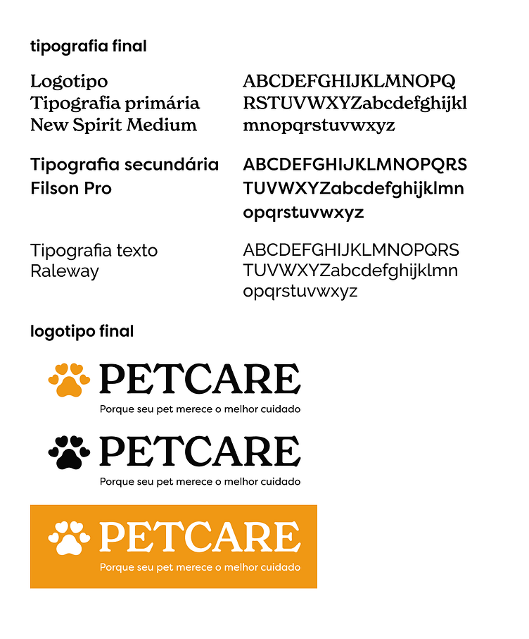
A tipografia primária usada no logotipo busca transmitir principalmente a seriedade, com a serifa curvada, porém trazendo o lado amigável com as barras e as barrigas dividindo as letras de forma equilibrada. A tipografia secundária já é mais divertida trazendo aspectos clean e geométricos e a tipografia para textos valoriza principalmente a legibilidade para textos longos.
For the color palette, I chose orange as the primary color because it conveys joy, optimism and the company's friendly tone; and as the secondary color, teal (blue-green) to convey the professional and strong side of the brand.
The primary typography used in the logo seeks to convey seriousness, with curved serifs, but also brings a friendly side with bars and bellies dividing the letters in a balanced way. The secondary typography is more fun, bringing clean and geometric aspects, and the typography for texts mainly values readability for long texts.
O logo foi desenvolvido juntando dois elementos mais relacionados à saúde e animais, o coração e a pata. Nos primeiros testes, foi observado qual formato de coxim se encaixava melhor. Depois, eu arredondei a ponta dos corações para tanto melhor remeter a pata quanto para deixar o logo mais amigável.
Com a tipografia e o logo já pronto, foi apenas juntá-los e adicionar o slogan da marca. A frase foi desenvolvida usando os significados de “pet” (bicho de estimação) e “care” (cuidado) do inglês; e a missão da empresa.
The logo was developed by combining two elements most closely related to health and animals: the heart and the paw. In the first tests, I observed which paw shape fit best. Then, I rounded the edges of the hearts to better represent the paw and to make the logo more friendly.
With the typography and logo ready, all that was left was to put them together and add the brand slogan. The phrase was developed using the meanings of “pet” and “care” in English; and the company’s mission.
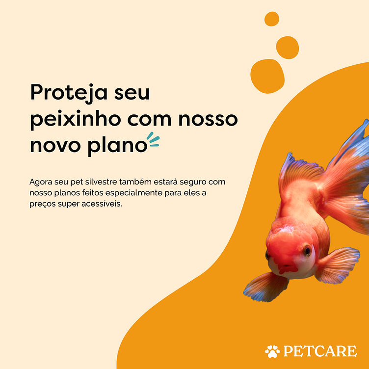
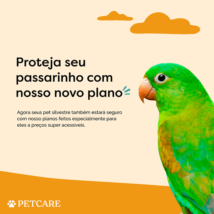
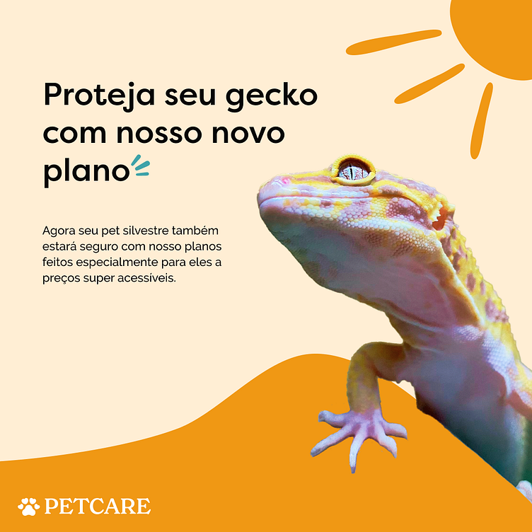
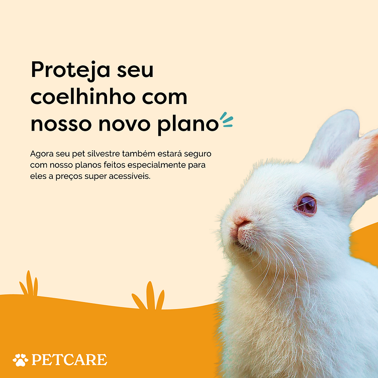
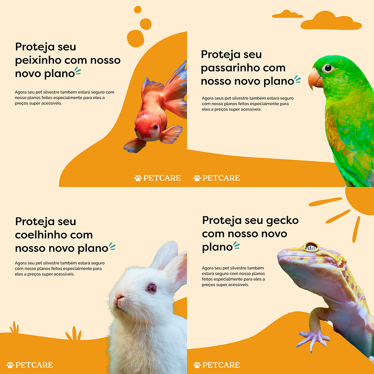
Eu usei elementos simples e minimalistas – que remetem a cada animal (ex. bolhas no post do peixe)– pois as imagens dos animais já trazem bastante complexidade e para evitar poluir a peça. O laranja acaba sendo a cor principal dos posts, com o fundo sendo em um tom mais suave; e o teal foi usado apenas em um pequeno detalhe trazendo destaque ao novo plano que o post quer divulgar.
Além disso, a linguagem de comunicação traz o tom amigável e divertido da marca, e também informa a acessibilidade e o compromisso da PETCARE.
Eu fiz quatro versões do mesmo post, mudando apenas os elementos, para que agradasse os donos de pets de cada um deles, trazendo a aproximação da marca com seu público.
I used simple and minimalist elements – which refer to each animal (e.g. bubbles in the fish post) – because the images of the animals already bring a lot of complexity and to avoid cluttering the piece. Orange ends up being the main color of the posts, with the background being in a softer tone; and teal was used only in a small detail highlighting the new plan that the post wants to promote.
In addition, the communication voice brings the friendly and fun tone of the brand, and also communicates PETCARE's accessibility and commitment.
I made four versions of the same post, changing only the elements, so that it would please the pet owners of each one of them, bringing the brand closer to its audience.