URBAN AND REGIONAL PLANNING LOGO

Hello everyone, Excited to share the logo design and the brand Identity of URBAN AND REGIONAL PLANNING Department.
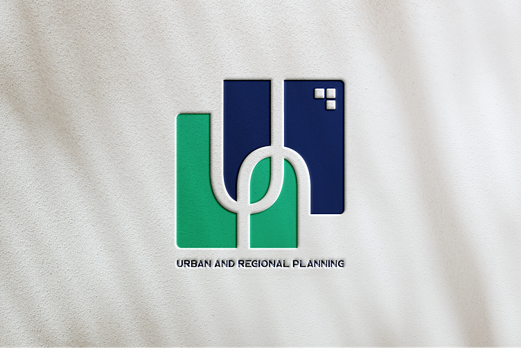
This is a Minimal and Negative Space Logo. This logo identify the abstract form of structures. All the shapes are symmetrically balanced in both horizontally and vertically. The 3 block indicates the windows of structures.
The first letter of Urban (U) is also highlighted in the logo. There are double U (flipped) together which symbolize the unity & association. It also create a form of Street patterns.
There is a leaf in the center of the logo which refers to The Green City. That means the logo promoting sustainable Green Urban and Regional planning.
One last thing, Two square shape create a form of overlay or the layers. It refers to the Geographic Information System(GIS). Different Layers of different color bands. There are two colors here. One for Urban and another one for Rural or Regional. Mostly used Green Color also promotes the Green Urban & Regional Planning.
Hope you guys like it! 💕
Wanna collaborate with us? Contact with me asap
__________________________________________________
UI/UX GALLERY | LinkedIn | Behance | YouTube