Ceratonia brand identity design

Case study
Challenge: The first stumbling block l had to deal with was coming up with a name that matches with message that was included in the brief. The message that was to be conveyed was faithfulness whilst being fresh at the same time. Secondly, was to ensure that the tone, personality, logo and visual identity resonates with the couples as well.
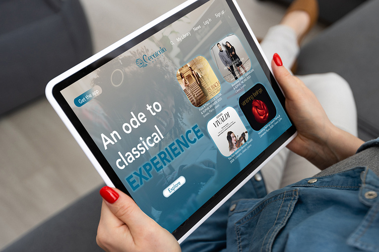
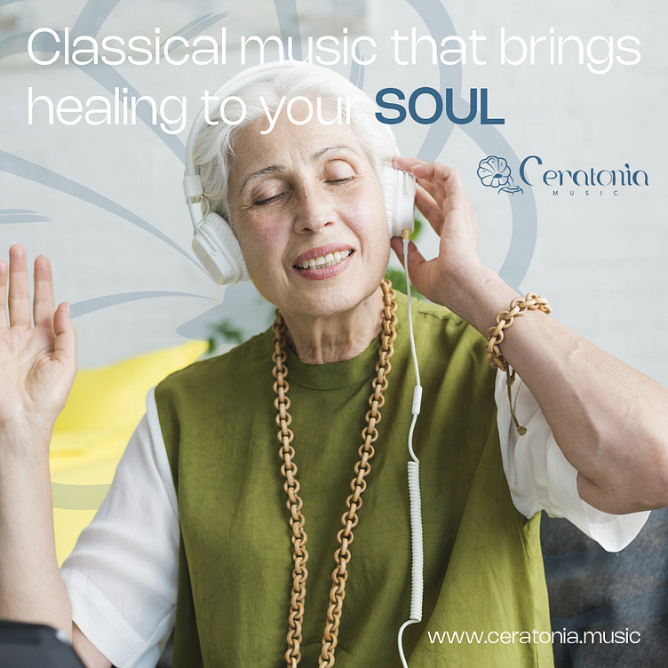
Solution: Embarked on a research, discovered that the demographics for classical music listeners were about 42% from the age of 41-60 years and above, 7% below 31 years. The goal was to ensure that from the brand name, personality, logo, visual resonates with both sides of the demographics.
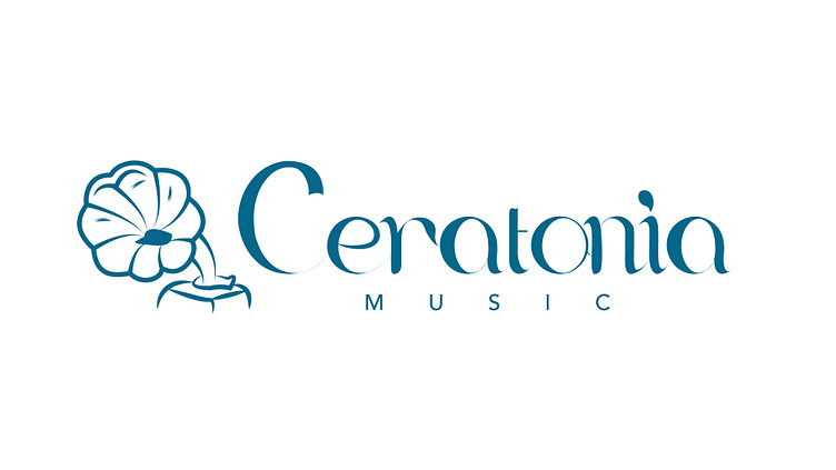
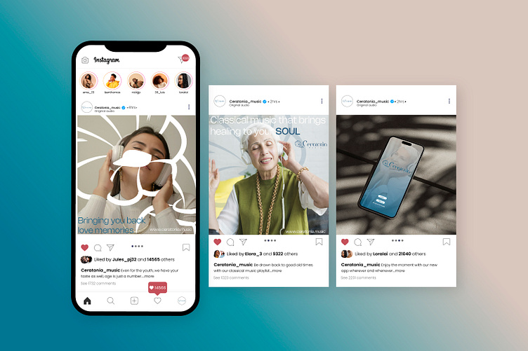
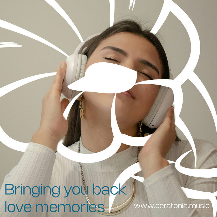
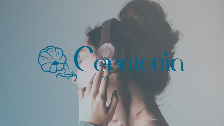
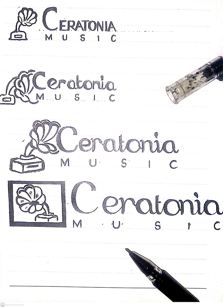
Brand name: To match with brand's message, l used "Ceratonia" which is an evergreen plant. Evergreen is associated with longevity , strong, fresh, life - so l used those features to convey the message of the brand which is faithfulness, and fresh. Being evergreen also meant that its deeply rooted, connected and difficult to tear it apart, same goes for the couples when in love.
Typeface: So l combined sans serif and calligraphy features to use it for the brand name. Calligraphy style tends to associate with personality attachments, even on wedding, birthday invitations cards make use of calligraphy style because its conveying friendliness, caring, kindness personality trait. Same goes with modern sans serif typeface as well if applied correctly to a message.
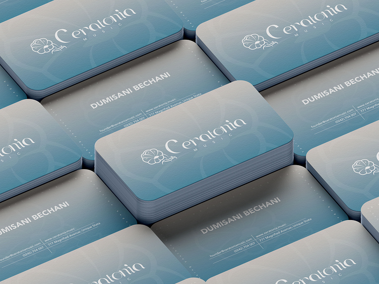
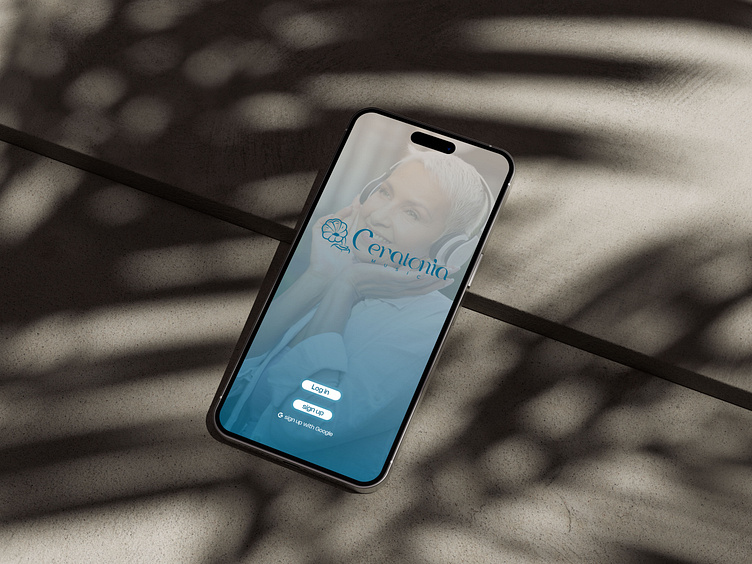
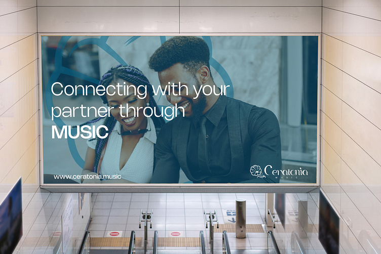
Colour: Couples tends to associates with calmness, peacefulness, comfort, friendliness traits and more. So the colour chosen is soft, peaceful blue, and for ascent colour to complement primary colour, used soft pink with light shades of grey which is a bit quiet and peaceful.