Bank UI

The Bank UI responsive app was designed as a project during my ‘Professional Certificate in UI Design’ course with the UX Design Institute.
The project (my first in UI design) comprised of a series of short exercises tailored to guide me through the process designing a responsive app that works across mobile, tablet, and mobile.
Step 1: Create Moodboards
My first task was to create several moodboards full of inspiration to help me with my designs later in the process. The idea was to find examples of apps that visually conveyed Bank UI’s brand principles – playful, clear, and trustworthy. The insights gained from the moodboarding helped me to make decisions on which fonts, colours, and other UI elements I wanted to incorporate in my designs.

Step 2: Create a Grid System
My next task was to create a grid system using a 8pt grid and 12 column grid. The column grid was adjusted to 8 columns for the tablet screens and 4 columns for the mobile screens. The purpose of the grid system is to ensure each screen has a structured layout with consistent proportions, spacing, and margins – resulting in pixel-perfect designs that are easier for users to read and scan.

Step 3: Choose Fonts
To comply with the brand principles, I did some research to identify the most playful and friendly fonts – and Lexend + Zilla Slab were among those highly recommended. It was also favourable that both fonts were open source and included multiple weights for flexibility. Initially, I paired both and intended to use Lexend has a headings font, and Zilla Slab as a body font, but as I continued to iterate my screen designs I settled on Lexend as the only font.

Step 4: Create a Colour Palette
As with the fonts, I searched for playful and friendly colour inspiration. I looked at competitor apps but also explored palettes with blue and green shades in them – as the colour blue is associated with banking and the colour green is associated with money. I consequently created a palette of my own, made up of blue and green shades as accent colours, but also modified my selection slightly as I went through iterations.

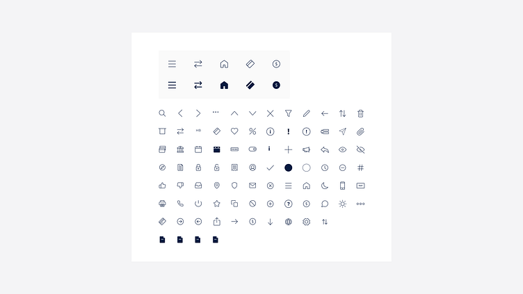
Step 5: Generate Icons
For icon inspiration, I looked at some competitive apps but also searched for banking/finance specific icon sets. As a minimalist, I favoured icons that were simple and stumbled across a set of open source icons that were perfect for my use case – so I stuck with those instead of creating a fresh new set of icons.
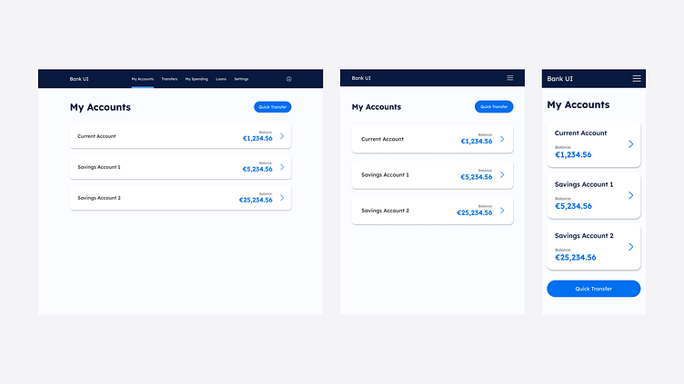
Step 6: Design Screens
I went through a few iterations and played with the different colours and Lexend + Zilla Slab font combination. As mentioned above, I altered my colour choices and stuck with one font only for the final designs. True to my UX learnings, I also kept the experience at the forefront of my mind for each design iteration. I tried to balance the required aesthetic creativity with a sense of simplicity, and the result was a minimal and intuitive set of screens aligned with the Bank UI brand values.


Reflection
Although this app was not actually built and launched, the project gave me thorough, practical exposure to the importance of UI in software design.
I wasn’t completely new to the concept of designing screens prior to this project, due to my experience with graphic design and using Figma, but I learned that alone isn’t enough when it comes to good UI design. I walk away with a deeper understanding of UI elements and the thinking that needs to go into selecting them for a design.
And most importantly, this experience layers on top of my exposure to UX design, giving me a holistic view of what it takes to design great software.