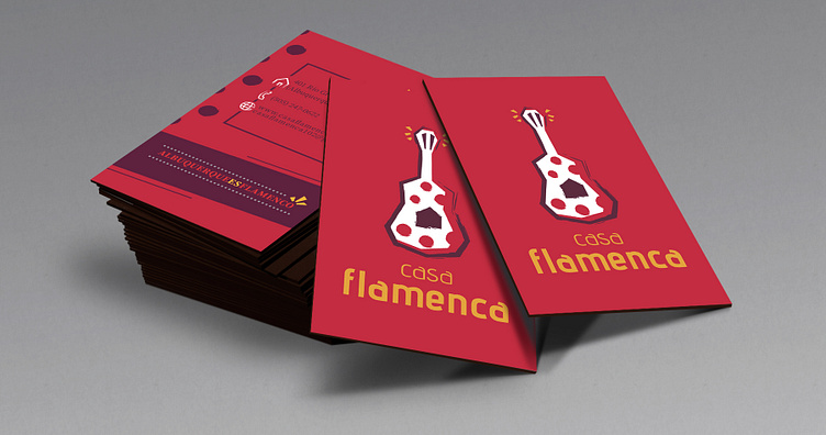
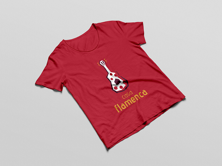
Casa flamenca

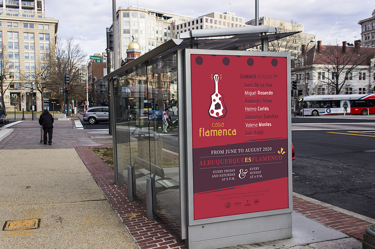
New visual identity of "Casa Flamenca", an events organisation whose mission is to teach and preserve the art of flamenco, located in Albuquerque (New Mexico).
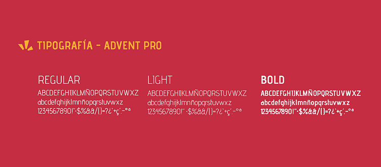
In the initial proposals I wanted to follow a very expressive line in the typography, to convey the passion and feeling of flamenco, but I had to take a step back, since the target audience is English-speaking and the priority was to communicate in a very clear and quick way the activity and the shows that are performed.
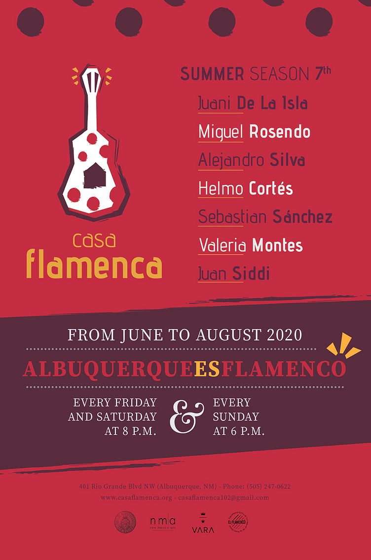
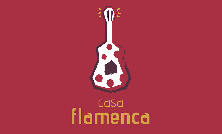
For this reason, we opted to use very identifiable forms, without using analogies that could confuse the user. We opted for a guitar with very marked strokes and angles that conveyed strength and punch.
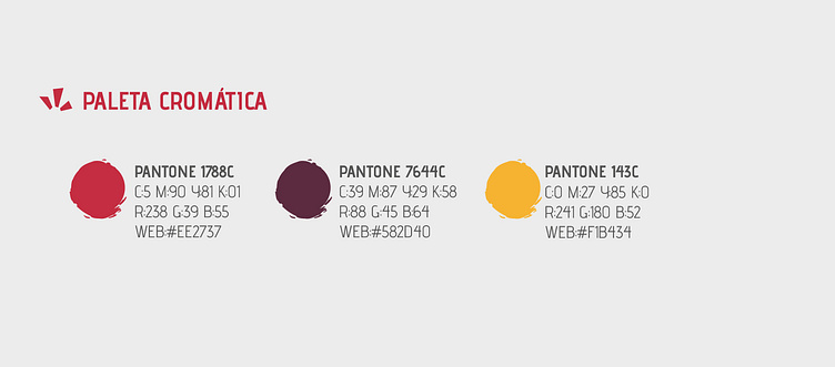
As for the colour, tones linked to the passion and joy of flamenco and Hispanic history were chosen, with the most emotional tone, red, having more weight than white and yellow.
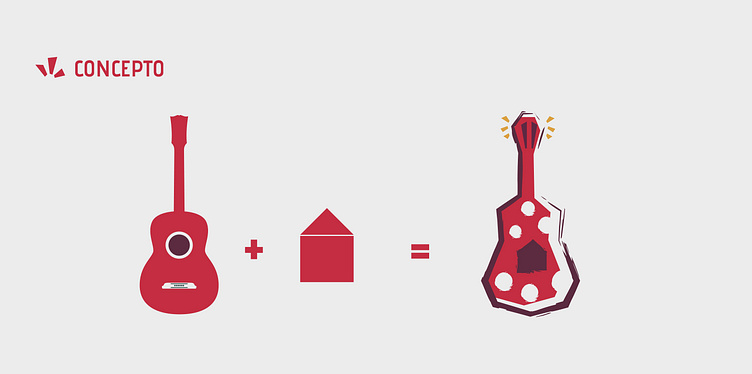
Concept
It was necessary to be very clear in the visual message for Casa Flamenca, avoiding local symbolism as the target audience is foreign, so I chose the most representative of flamenco, a guitar, with a very marked style, showing the strength and feeling of this art.