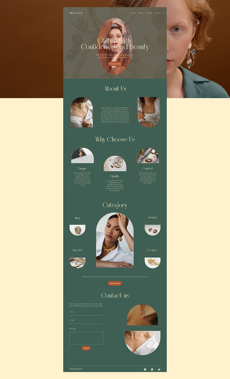
H&H Jewelery - Landing Page Website
My main focus for the design was to provide relevant information about the brand through a balance between luxury and simplicity.
I achieved simplicity by using white space to ensure a comfortable and uncluttered browsing experience.
To give it the feeling of luxury that resonates with the brand’s essence, I used the following to my advantage:
Combining warm and rich colour tones from the logo’s colour palette, sophisticated typography, and strategically placing high-quality images of the product to guide the user’s gaze seamlessly through the page.
Follow me on instagram for more: https://www.instagram.com/designedbyhazze/
Behance case study: https://www.behance.net/gallery/182036757/Jewellery-Website-Landing-page
More by Hazze Dale View profile
Like

