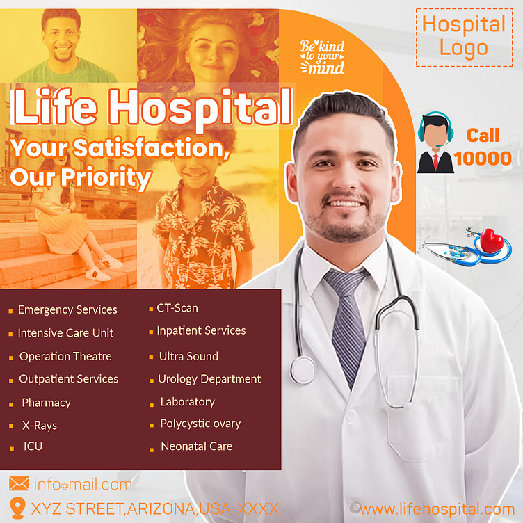
Promotional Designs for hospitals
estate campaign here’s a detailed breakdown of the design elements typically included:
1. Visual Elements:
o High-Quality Images: Use professional photos of properties, interiors, and exteriors. Showcase the best features.
o Floor Plans: Include floor plans or layouts to give potential buyers a clear understanding of the property.
o Virtual Tours: Create short video clips or 360-degree virtual tours to engage viewers.
2. Typography:
o Clear and Legible Fonts: Poppins & Wilkysta
o Highlight Key Information: Use bold text for headlines, property details, and calls-to-action (CTAs).
3. Color Palette:
o Neutral Colors: Stick to neutral tones like whites, grays, and beige. These evoke a sense of cleanliness and sophistication.
o Accent Colors: Add pops of color (e.g., blue for trust, green for growth) to draw attention to specific elements.
4. Layout:
o Grids and Columns: Organize content in a grid or column format. Show property images alongside key details.
o Whitespace: Use whitespace to create a clean and uncluttered design.
o CTA Placement: Position CTAs strategically (e.g. “Book Now”).
5. Content:
o Testimonials: Include positive reviews from satisfied clients.
o Market Trends: Share relevant data (e.g., rising property values, demand in the area).
6. Branding:
o Logo: Include your real estate agency’s logo for brand consistency.
o Contact Information: Display phone numbers and website URLs prominently.
