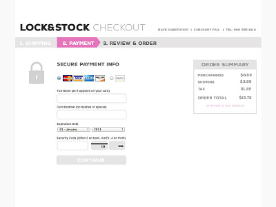
#dailyui #002 Credit Card Checkout
For my second #dailyui project, I've done an homage to Crate & Barrel because I love their clean checkout style.
This is my mythical eCommerce company, Lock & Stock, which I'm imagining sells rock n' roll-style stockings and underthings for ladies.
I imagine that as soon as the necessary fields are filled out, the "continue" button will change to the same pink as the payment section of the progress bar to demonstrate a ready condition.
More by Leitha View profile
Like
